LOOK!

Recently I've been in the grip of Hitchcock mania.  He's one of
those artists whose work is so rich that you experience it completely
differently at different stages of your life.  As a teenage film
buff I thought his work was delightfully cinematic but shallow. 
Truffaut's book of interviews with the director got me to take him a
bit more seriously, but not for too long.  I went through an extended
period when I thought of him as primarily a master of style.

Recently, however, I've re-watched almost every movie he ever made, and
the work opened up to me in a new way.  Films I'd considered minor,
like The Birds, began to reveal their subversive depths, and films I'd greatly admired, like Vertigo,
began to take their place for me among the greatest achievements of
film art — indeed, among the greatest achievements of any art.

In the midst of this mania a package arrived from my friend PZ containing the copy of Look magazine pictured above, from 1962, the year PZ and I met, featuring some pre-publicity for The Birds.  An object like this obliterates time — allows you to imagine The Birds
not as a famous classic from the past but as an enterprise in the
working life of a director, enmeshed in the practical contingencies of
filmmaking, which for Hitchcock always included close attention to
publicity.

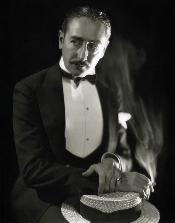
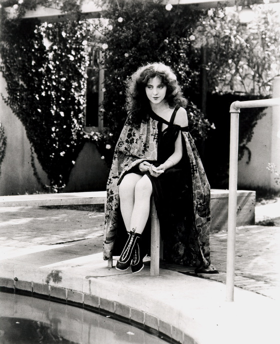
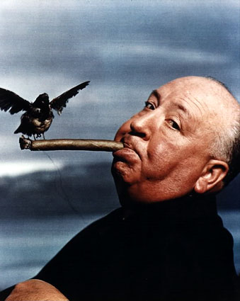
In the article inside the magazine this image appears — another time
capsule, from an age when smoking was considered elegant and sexy:
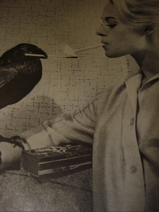
Call me degenerate but it still looks elegant and sexy to me.

The art critic Dave Hickey once observed that it was hard to imagine
any culture being both risk-averse and sexy — and it's undeniably true
that American culture has become less sexy (though arguably more
pornographic) since the baby-boomer Yuppies took control of it.

Hitchcock's movies are sexier than movies today because he recognized
the connection between moral jeopardy and the erotic.  In an
amoral society, or one that confines its most passionate moral concerns to areas
of personal health, the erotic simply vanishes.

If your soul isn't on the line in a sexual encounter, in any encounter,
you might as well
be playing ping pong.  Hitchcock believed in souls, and knew that
souls are always in danger, always in jeopardy, always in
suspense.  Leading a healthy lifestyle, practicing safe sex, or
safe ping pong, can't deliver you from this fact — however persuasively our culture argues otherwise.

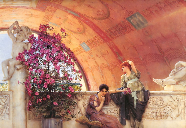
AN ALMA-TADEMA FOR TODAY


The title of this painting is Unconscious Rivals,
implying a narrative content that isn’t really apparent in the work
itself but suggesting how Alma-Tadema’s imagination worked.  He
wanted to present the ancient world as brand new, almost
photographically convincing in visual terms, and to people it with
humans exactly like ourselves, as opposed to classical emblems of
virtue or vice.  In this he was following the classical style more
closely than some of his neo-classical peers in 19th-Century art.
Even when Greek sculptors in antiquity were depicting mythological
beings, they always endowed them with an essential humanity just as
vital as their symbolic personae.

The play of light in this painting is magical yet perfectly naturalistic, and I
love the way Alma-Tadema has obscured our view of the distant sea,
which only makes us look deeper into the space of the painting to
register it.  It also makes us imagine walking up to the railing
for a better view — drawing us into the foreground space as we imagine
navigating it.

THE MARRIAGE CIRCLE

At first it seems as though this film, like a Seinfeld episode, is going
to be about nothing, but in an amusing way — about flirtation not
love, suspicion not jealousy, pique not passion. From the start you
just don’t care, because it’s all done with such delicacy and style.


The performers hardly seem to inhabit the same artistic universe as
Pickford, Keaton, Lloyd — the brash, innocent, plastically
explosive world of mainstream Hollywood movies in the silent era.
There’s a languor, a subtlety, a world-weary wittiness in the playing
that contribute to an overall tone which Lubitsch seems to have
imported wholesale from Europe (by way of Chaplin’s A Woman Of Paris) and cast like a spell over his American actors and crew. No collision of aesthetic strategies here, of the sort we see even in some of the greatest Hollywood silent films — this
artistic vision is of a piece, totally assured, astonishingly mature.


And though this vision derives to some degree from literary sources, from
turn-of-the-century European plays and novels, it has been
fundamentally reimagined in visual terms — intertitles are sparse and
virtually irrelevant. Lubitsch’s visual style is not, however, one of
great plastic power — the felicities of it are on a small scale,
restrained and minutely observed:


A flower falls accidentally from the hands of a woman and lands, in close up, at the feet of a hopeful suitor. There is a pause — we sense the suitor looking down at it in wonder — before he picks it up.

A happily married couple are having breakfast — Lubitsch lingers in close up on the egg he’s breaking, the coffee she’s stirring, until they abandon the tasks and embrace . . . off screen.

A woman at an indiscreet garden rendezvous throws off her scarf
seductively and it blows away — we see it land in close-up at the feet
of her indiscreet partner’s wife, somewhere else in the garden, catch
on the foot of the wife’s importunate companion . . . it’s carried
along by him, still in close up, until the wife steps on it, and they
both realize something is amiss.


A straw hat travels about town during the course of one romantically disastrous night, passed along from one lover and would-be lover to another, forgotten, discovered, brandished, claimed.

Gradually, as the tiny missed connections between people accumulate, as the
minute, half-conscious indiscretions gather momentum, as the
unhappiness of Mizzi, the character at the center of the tale, radiates outward and infects all those around her, the movie becomes profound. Inconsequential acts fill the void at the
center of feckless lives and melancholy, incurable because it’s unexamined, creeps into the farce.

When Mizzi, to distract her husband from some incriminating bit of romantic
evidence, embraces him and says, “I need to be loved,” it’s both a ruse
and a true confession — and the look of bemusement and surprise on the
face of her husband, played with miraculous precision by Adolphe
Menjou, is actually heartbreaking. Just for a moment he believes her —
until that darned straw hat turns up once again and his habitual
cynicism is confirmed.

Nothing is ever quite what it seems in this film, a fact that is admitted and
even celebrated in the finale between the “happy” married couple — who
achieve their reconciliation by a double ruse in which each is deceived
and each the deceiver. Only we, the audience, know the whole story. The
suggestion is that the difference between a good marriage and a bad one
is luck, a healthy dose of ignorance, and just a little extra — almost
imperceptible — application of goodwill.


In the end, The Marriage Circle is not about nothing after all — issues of enormous consequence are caught up in its gossamer threads. It’s very great filmmaking and very great art.

A BRAND-NEW PAINTING


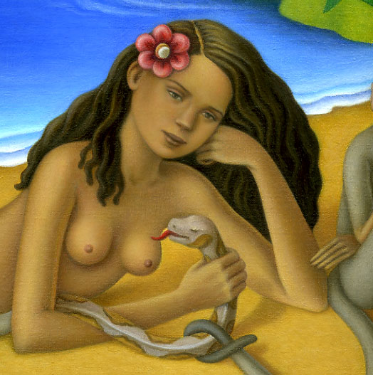
Amy Crehore, the artist whose blog
Little Hokum Rag offers a running
record of the images that inspire her, has posted a first look at a new
painting — teasing us with just some details for now.  One of the
virtues of the Internet is allowing artists to share their productions
in real time like this — the paint on Crehore’s canvas is probably not
even dry yet.  It’s the virtual equivalent to a “visit to the
artist’s studio”, always considered a privilege of the well-connected
connoisseur.

[Update — the whole painting has now been revealed on Crehore’s site and it’s really wonderful.]

A TISSOT FOR TODAY

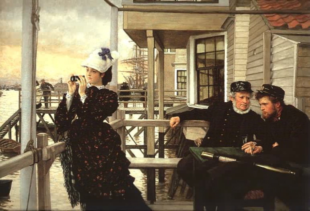
The porch and table with figures creates its own space, echoed in the space
of the pier with figures behind it, drawing our eye deeper into the
image, to the spars of the docked ship, the buildings and the course of
the Thames winding into the distance.


The girl, the captain’s daughter of the painting’s title, looks in the
other direction, counterpointing our attention.  We feel that if
we just turned our heads we would see what she’s seeing.


We’re not simply looking at something — we’re inside the painting . . . we’re somewhere.

SAUL STEINBERG AND ALFRED HITCHCOCK

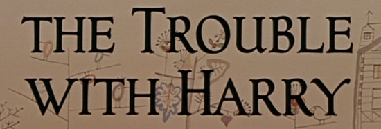
The delightful drawings behind the opening credits of Alfred Hitchcock’s 1955 film The Trouble With Harry were done (uncredited) by famed New Yorker artist Saul Steinberg, riffing on images from the paintings of Paul Klee.  Hitchcock was a collector of Klee’s work and may well have asked Steinberg to incorporate the homage.

The Steinberg drawings seem to echo a style in 50s design and animation called “cartoon modern”, which I wrote about in an earlier post — though of course the cartoon modern style derives from the whimsical abstractions of artists like Klee and Steinberg, not the other way around.  It’s an example of the way artistic ideas percolate up and down the scale from high to popular art.  In 1955, Klee was high-brow art, Steinberg (at least when he was publishing in The New Yorker) was middle-brow art and Hitchcock was low-brow art.  Today you could hardly rank Hitchcock below either of the other two on any scale of art — which just goes to show how silly and ephemeral such distinctions are, and ought to make us wonder what art today is undervalued because it’s stuck into some temporary and ultimately meaningless hierarchy.

WHY WORRY?


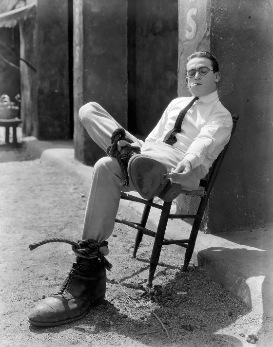
Harold
Lloyd's
Why Worry? (from 1923) is an almost perfect film. Its scale
is relatively small compared to the films that bracket it in the Lloyd
canon, with a more modest action finale. It lacks the breathtaking
spectacle of the climactic sequence of
Safety Last and the epic
momentum of the race to the rescue in
Girl Shy, but it makes up for
this with a delirious escalating rhythm and a truly romantic lyricism.
The “love interest” is effectively integrated into the plot and
unusually strong for a slapstick comedy.


One
fair criticism one can make about
Safety Last concerns the decidedly
unromantic notion that Harold must become financially successful to win
his true love. This leads him into acts of physical courage by the end
of the tale, but we never quite lose the idea that he's risking his
life for cash — the girl comes to seem like a trophy that goes along
with it.


Girl
Shy
has a more developed love story but, again, financial success is
the sine qua non of romance, and even when Harold attains it, his final
triumph is still predicated on the fact that his rival for the girl's
affection is already married. The actual, personal love story gets lost
(or perhaps cheerfully abandoned) somewhere along the way.


The
issue of acquiring wealth doesn't arise in
Why Worry? because Harold
starts off rich, and that's his problem — he's selfish, spoiled and
self-involved. It's almost a relief to see this critique of the wealthy
set down amidst Harold's more familiar personifications of the
single-minded near-manic American go-getter.


His
character here is a hypochondriac, obsessed with his health. He travels
with his nurse, the ever-vexing Jobyna Ralston, and his butler to a
small tropical country for “recuperation” from his non-existent
maladies. Ralston is secretly in love with him, apparently seeing
something in him that we can't — at least not yet. He'd be in love
with her, too, we sense, if he could ever look beyond the end of his
own sniffling nose.


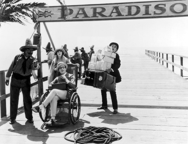
When
they arrive in paradise, the little country is in the grip of a
revolution. The gag that propels most of the rest of the comedy is that
Harold can't imagine that anything that happens in the world isn't
taking place for his personal convenience. He fails to notice the
mayhem around him. Paradoxically, this makes him behave heroically —
since he doesn't perceive the jeopardy, he overcomes it easily at every
turn.


One
can read this as an image of American arrogance — what's a little
revolution in a third-world backwater to us? One can read it
simultaneously as a sort of ironic vindication of American optimism, of
a naive Yankee ingenuity. What one can't read it as, in the context of
the story, is genuine heroism. Harold isn't actually triumphing over
danger, since he doesn't see anything as really dangerous — not to
him.


But
eventually things become more complicated and interesting. When he gets
thrown into jail by the insurgents, he finally begins to realize that
something is amiss — he thought they were escorting him to his hotel.
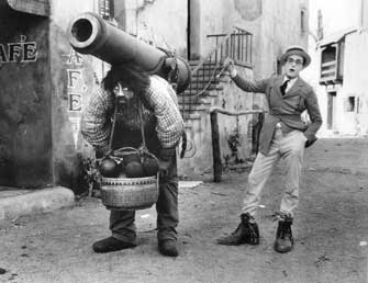
He's locked into a cell with a violent and gigantic maniac, whose
violence is currently exacerbated by a howling toothache. Harold's
refusal to take him seriously as a menace seems to perplex the giant,
and soften him. “Let's escape,” says Harold, with blithe practicality.
They do, and Harold manages to extract the aching tooth — making the
giant his pal for life, and very soon his accomplice in putting down
the revolution and restoring order.


This
is the first stage in Harold's moral rehabilitation — his democratic
solidarity with the outcast giant and his act of simple, practical
kindness towards him get for Harold in return the giant's awesome
strength, which, combined with Harold's wit, makes for an unstoppable
force.


Meanwhile,
Ralston has gotten lost and is hiding out from the insurgents dressed
as a man, a caballero. Somehow this makes Ralston even more vexing,
both to us and to Harold. When their paths cross again Harold is able
to see her, out of the usual nurse's uniform, as a distinct person —
not just as a provider for his needs. All his defenses crumble. “Why
didn't you tell me I was in love with you?” he demands petulantly.
That's the residue of a character he has already started to shed.
Seeing Ralston in danger makes this whole revolution personal for
Harold — his half-conscious or merely practical heroism now becomes
deliberate and important. He is prepared to enter the world fully,
engaged not just as a restorer of order but as a committed lover. He
has grown up.


He and
Ralston and the giant, equal partners now, quickly defeat the insurgent
army and sail off happily for America, where the giant gets a job as a
traffic cop and Harold and Ralston get married. The film ends, sweetly,
with Harold collecting the cop to come and celebrate the birth of his
child.


The
lyricism and romantic conviction of the tale unfold in an unbroken
chain of evolving slapstick incidents which tumble into each other like
the incidents of a dream — perfectly logical until you think about
them for a second. The gags, always ingenious and funny, become
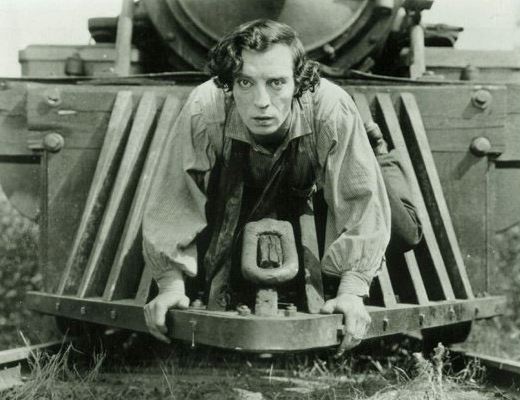
beautiful, too, as they do, for example, in the train sequences of
The
General
. The girl becomes more than a sidekick or a goal — she
becomes, in fact, the whole motor and point of the story.

At the
beginning of the film, there's a beautiful blue-tinted scene set on the
deck of the steamer taking the party south — a dance lit by strings of
lanterns, with a calm sea rolling along behind them. It's there that we
realize that Ralston is in love with Harold and there that we decide he
ought to be in love with her. It prepares us for a romance — and that
is what we get in the end, in the unlikeliest and loveliest of ways.

ANDERS ZORN

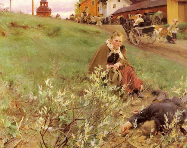
Recently, thanks to Amy Crehore’s blog Little Hokum Rag, I discovered the work of the amazing Swedish painter Anders Zorn.  Zorn started his career in the Victorian era and his paintings share some of the attributes of the Victorian academic schools — an almost photo-realistic style combined with an emphasis on the dramatic use of spatial depth in the image (see above.)

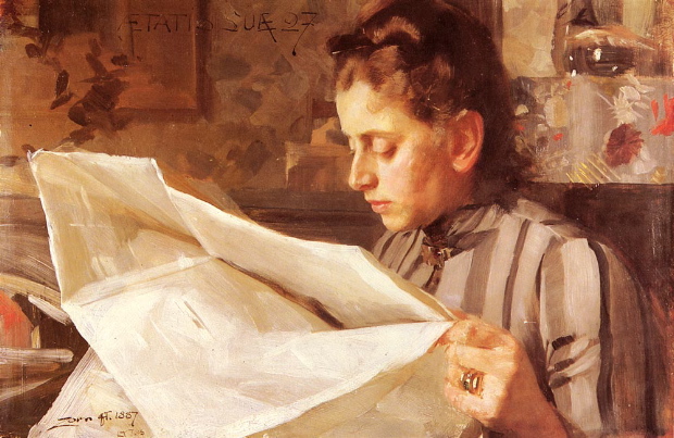
But Zorn worked into the first two decades of the 20th-Century and like Sargent, another quasi-academic, he was attracted to the free brushstrokes and painterly surfaces of the Impressionists.  Indeed, some of Zorn’s wonderful  portraits of women can stand favorable comparison with Sargent’s work:

Like Gérôme, Zorn’s interest in stereometric forms led him to work also in the medium of sculpture:

Zorn was justly celebrated for his images of water, in which the sensual brushstokes render with convincing precision the surfaces of sea or river or lake:

Zorn is perhaps most famous for his plein air nudes.  In them he abandons any hint of the allegorical or classical, which tended to inform the Victorian academic approach to the nude, for a frank celebration of the female body in a natural setting.  I wouldn’t be at all surprised if these nudes influenced Andrew Wyeth’s portraits of naked women out of doors — which have the same sort of directness, as though we, the viewers, had simply stumbled upon a woman walking around naked through the woods:

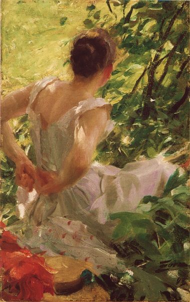
There’s a hint of the voyeuristic in the approach — you get a sense that Zorn’s models might be startled (though perhaps not embarrassed) to find someone looking at them.  The image below seems to reflect something of Zorn’s attitude — seen from behind, one of his models appears to be disrobing for him out of doors, or getting dressed again after posing, but Zorn appears to be spying on her without her knowledge.  There’s no sense of violation — just of a secret delight.

I think it’s one of the sexiest images in all of art:

101 DALMATIANS

Above is some beautiful concept art from one of my favorite Disney animated features, 101 Dalmatians.

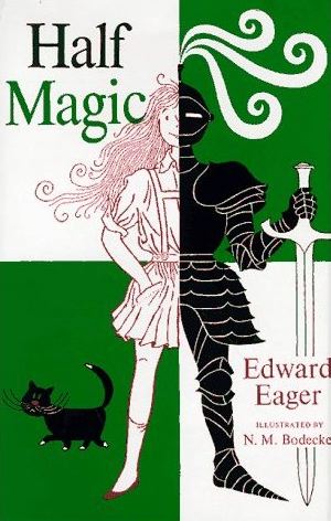
Compared to the classic fairytale epics, this film is almost a chamber piece, with a quiet, cozy, gentle humor — interrupted, of course by the delirious Grand Guignol of Cruella DeVille.  Its modernistic (for 1961) line-drawing style reminds me of the work of the great N. M. Bodecker, who did the wonderful illustrations for the Edward Eager magic-themed children’s books.


Despite its reaching for a newer, more linear style, and the fact that it used Xeroxing to help in the transfer of the artists’ drawings to the cels, 101 Dalmatians has a fully animated look and makes exciting use of composition and animation in depth. It’s the perfect film for a winter’s night by the fire, with some cookies and a cup of hot chocolate.

CINEMA AS A PLASTIC ART: A PREAMBLE


Moving picture images are magical not because they move, not because they can efficiently convey factual or narrative information, and not because they can be composed to produce pleasing graphic effects — although, of course, they can do all of these things.  Moving picture images are magical because they can create the illusion of a space on the other side of the screen into which we look and into which we project ourselves experientially.

The fascination and appeal of this illusion can be simple, even crude — witness the famous story of the first public projection of the Lumière brothers’ Train Arriving In A Station, in which a train, moving on an angle almost directly towards the camera, caused spectators to duck and scream, as though they thought the train might might leave the illusory space of the projected image and penetrate the real space of the auditorium.


Of course it’s doubtful that people actually felt themselves in danger from the projected image — the reaction was physiological.  When you see something that looks big and solid and seems to be hurtling towards you, you duck first and think later — very much the way a Cinerama traveling shot filmed from the front of a roller-coaster car can cause slight nausea.  The eye tricks the body into a physical response.

Our eyes, conditioned by long experience watching moving pictures, are not as innocent as the eyes of the people who ducked and screamed at the Lumières’ train, but we still react viscerally to the imaginary space on the other side of the movie screen.  Shots which emphasize the illusion of space on the other side of the screen still draw us imaginatively into that space, cause or allow us to participate more fully in the action that seems to be going
on there.

When lighting or framing or camera movement or choreography of action within the frame intensifies the spatial illusion, our attention becomes more focussed, our ability to project ourselves into the action of the film more pronounced.  This is something all great directors have known, consciously or intuitively — as they have known how to manipulate the phenomenon for specific emotional effects.

It would seem that most of the truly great directors understood the phenomenon intuitively.  Griffith’s first film, made in 1908, works hard to create the illusion of spatial depth and to exploit it in every shot — something that was far from routine in films, especially narrative films, of the time.


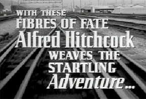
Hitchcock, a child at around this same time in the development of movies, said the first films that captured his imagination were part of a non-narrative series called Phantom Train Rides, in which a camera was mounted on the front of train and simply filmed the unfolding journey, penetrating space and thus emphasizing the spatial illusion of the film image.  (One such film, From Leadville To Aspen, with a brief interpolated narrative plot, can be seen on the More Treasures From American Film Archives DVD box set — and the opening of Strangers On A Train has an exceptionally beautiful shot, used also in the trailer for the film, below, from the front of a moving train that echoes the technique of the Phantom Train Rides.)


Hitchcock also said that when he was a teenager what impressed him most about American movies was their use of backlighting to separate foreground figures from backgrounds, to give the impression of “relief” — spatial depth.

The techniques listed above for intensifying spatial illusion in movies all tend to exploit the basic three-dimensional quality of the photographic image, its optical coherence with regard to perspective, to give the impression of a space which is malleable, filled with potential for movement within it.  They reveal the illusion of cinematic space as something akin to real space, which can be redefined and re-analyzed by movement, molded — as something, in short, which is plastic.

Film images are routinely analyzed for their graphic qualities and for their factual or narrative content, but they are very rarely analyzed for their plastic qualities, even though these qualities are precisely the ones which constitute their power and seductiveness, the ones on which our responses to a film are primarily based.

There needs to be a whole new criticism of film centered on its identity as a plastic art.

A DIRECTOR'S LIFE


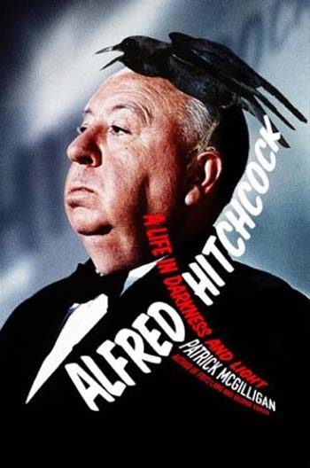
Alfred Hitchcock: A Life In Darkness and Light

may be the best biography of a film director ever written.  Long
and detailed, filled with fascinating information about all aspects of
Hitchcock's life and films, it's also a great read, almost as
entertaining as a Hitchcock film.


There have been two previous full-scale biographies of the director. 
Hitch,
by John Russell Taylor, was published in Hitchcock's lifetime and with
his cooperation — it sets forth the basic facts without delving too
deeply into problematic areas.  Donald Spoto's well-known
The Dark Side Of Genius,
published a couple of years after the director's death, was more
detailed and uninhibited but, as its title suggests, had a somewhat
slanted point of view.  It marshaled evidence and highlighted it
in such a way as to expose primarily the neurotic and malicious side of
the man.


Patrick McGilligan, as his title suggests, tries for a more balanced
view, and specifically challenges many of Spoto's interpretations of
events and sources, while treading fearlessly into territory that
Taylor avoided.


None of the books solves the mystery of Hitchcock's genius and art,
because genius and art are mysteries without solutions, but in
McGilligan one finds a plausible Hitchcock, one that contains all the
complexity and contradiction of the films themselves, the darkness and
the light.


It's a terrific achievement.


[Apologies for the web log's disappearance for a couple of days — it
exceeded its allotted bandwidth     . . . too many visitors!  I think
the problem has been solved, and thanks for the interest!]

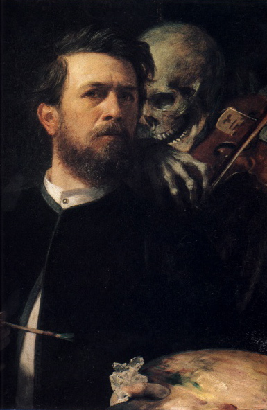
ISLE OF THE DEAD

Above is an amazing image by the 19th-Century Swiss symbolist painter Arnold Böcklin — Self Portrait With Death.  I stumbled across it while looking for another Böcklin painting, The Isle Of the Dead, which Hitchcock reportedly used as a visual frame of reference for Vertigo.

The Isle Of the Dead (below) is almost as spooky as the self-portrait, and while it’s not referenced directly in Vertigo, its mood and basic visual strategy obviously informed a lot of the film’s compositions involving Madeleine, the ghostly, morbidly-obsessed heroine, who often appears as a distant, deathly-still figure set against backgrounds of dark trees and the sea.

HEADIN' HOME


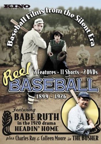
Unless you're one yourself it's probably hard to
imagine how wondrous and magical it is for a baseball fan to watch Headin' Home — one of the films on Kino's new silent-era baseball
set.

The film features Babe Ruth looking unbelievably young
and unusually lanky.  The year was 1920 and the Bambino had just been
traded to the Yankees — a year later he would have the most incredible
season any baseball player has ever had and probably ever will have. 
(He hit 59 home runs that year — a recent book estimates that under
modern rules and field dimensions the total would have probably been
101, all with the old “dead ball”.)

Ruth looks remarkably composed in front of the camera,
even in the scenes that call for acting — his minimalist style has
aged very well.  But what's really stunning is just watching him move
— you see a physical grace and ease, an elegant self-possession, that
doesn't always come across in documentary footage of his on-the-field
play.

Roger Angell has suggested that a core appeal of
baseball in the urban America of the early 20th-Century was its aura of
the pastoral — its wide greensward, like a big enclosed meadow, and
its easy rhythms reminding transplanted urban dwellers of their rural
roots.  Headin' Home confirms this insight in a way.  It's conceit is
to construct a fictional biography of Ruth as the product of a small
town and small-town values.  This was a far cry from the Babe's actual
childhood on some of the meaner streets of Baltimore and in an
orphanage, but it represents how America wanted to view its baseball
heroes.

It must have been strange for Ruth to enact the
fantasy youth conjured up for him by the filmmakers — choppin' down
trees, carvin' his own bats, eatin' mom's apple pie and goin' to the
church social — but he looks utterly nonplused by the whole exercise. 
(Ruth
had a delightful and quintessentially American matter-of-fact attitude
to everything.  When asked how he felt about making more money than
Herbert Hoover, the President of the United States, Ruth said, “I had a
better year than Hoover.”)

The film appears to have been shot somewhere in
Upstate New York, and it offers delightful images of small-town America
in 1920, including a wonderful recreation of a local ballgame between
rival small towns. 

The film also incorporates footage of Ruth in action
in an actual big-league game — part of a framing device in which an
old fellow attending the game reminisces about the Babe's youth “back
home” with genial if uninspired cracker-barrel wit.

But it's the physical presence of Ruth himself that
enchants, whatever he happens to be doing — it's like seeing
documentary footage of Achilles engaged in some amateur theatricals or
demonstrating his prowess with a spear . . . documentary footage of a
mythological being.

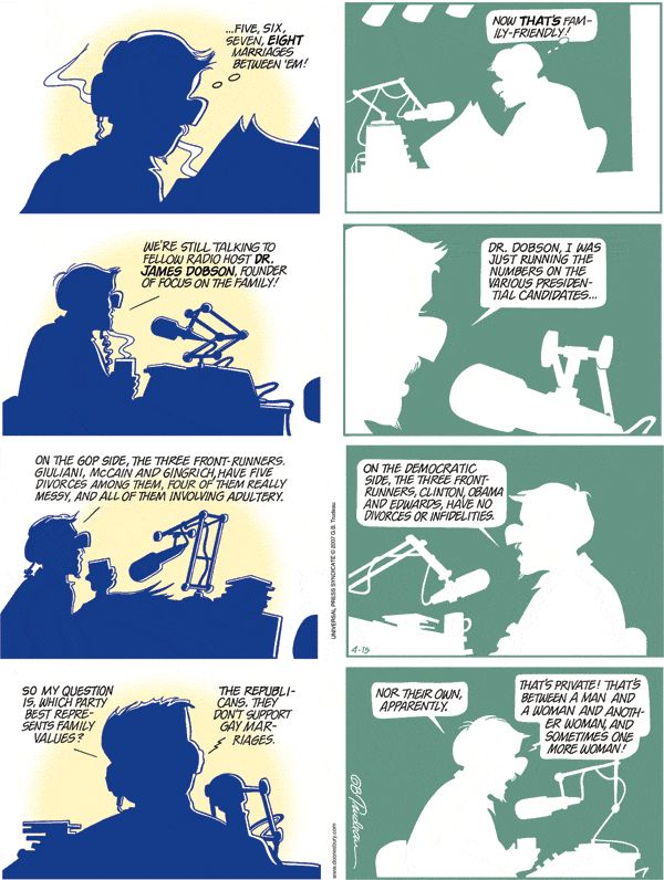
FAMILY VALUES


I'm not a big fan of
Doonesbury,
even though I feel a connection to Gary Trudeau, because he was few
years ahead of me at the New England prep school we both
attended.  His cartoons used to be featured in the school
newspaper, and the title of his comic strip derives from school slang
in the 60s, in which “doon” was a term roughly equivalent to “dork”.


I tend to share
Trudeau's political views, but find his expression of them a bit smug,
a bit self-righteous.  Too preppy, maybe.  Sometimes, though,
he really nails it . . .

JANE EYRE

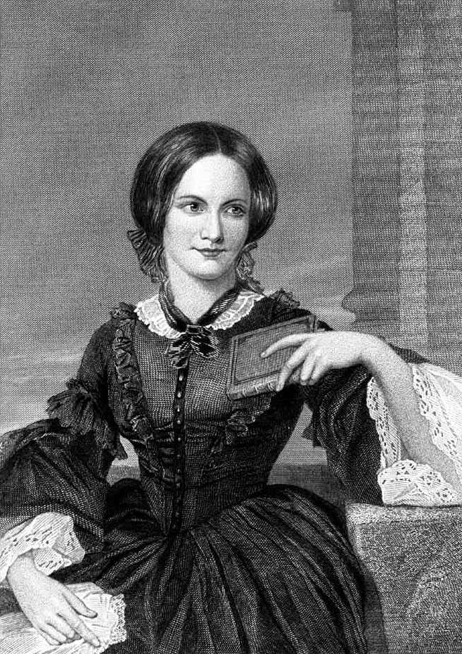
Jane Eyre by Charlotte Bronte (above) is over six hundred pages long, but it’s a page-turner . . . you just can’t put it down. Thackery said that about it when he first read it in 1847 — my experience of it a couple of years ago was no different. Part melodrama, part Gothic thriller, part love story, Jane Eyre is, of all the truly great novels, the most shamelessly entertaining. Wild coincidences, lurid situations, spectacular violence are called upon unselfconsciously to interest and thrill the reader — but nothing in the book is more interesting or more thrilling than Jane herself, Jane’s fearless voice.

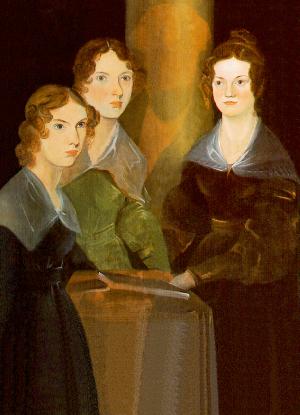
The fierceness of the female soul, the subtlety of the female heart, have rarely been so exposed in fiction, and almost never from the inside, as it were — Wuthering Heights by Charlotte’s sister Emily (below, as painted by her brother Branwell) being one other notable exception.

In Jane Eyre and Wuthering Heights we eavesdrop on a woman’s
conversation with herself. We do the same, at times, with Tolstoy’s
Natasha and Shakespeare’s Cleopatra — but their creators listen for
what men want to know about them. Jane Eyre tells us what’s important
to her, what she wants us to know.


I suppose it’s not surprising that these two Bronte sisters, who grew up
with their two other siblings in a world of their own among the
desolate moors, a world of imagination and intellect unconstrained by
the conventions of the Victorian patriarchy, should have developed such
singular and courageous voices. (That’s Bramwell’s portrait of his
three sisters, Anne, Emily and
Charlotte, above.)  And not surprising, either, that their eventual experience of the wider world, where such voices from women
were hardly approved, led to a savage indignation — and a desire to
express it.  (Below is a picture of the Bronte family cottage in Haworth by the edge of the moors.)

The love story in Jane Eyre, however fantastical its setting, is the most
penetrating examination of love from a woman’s perspective ever penned.
In Mr. Rochester, Charlotte imagined an ideal man — ideal not because
he was good, or handsome, or gallant . . . but because he looked at
Jane and knew her, recognized at once her power and individuality. And
these things did not frighten Mr. Rochester — they delighted him.

Byron, writing a bit before Charlotte’s time, said of some current flame, “I
would, to be beloved by that woman, build and burn another Troy.” But
Jane would reply, “Before you set to work on Troy, look at me — know
me.” What was Troy to her? What, for that matter, had it been to Helen?

Mr. Rochester talked to Jane. What is more astonishing, he listened to her. That’s what made him her Achilles, her Hector, her Odysseus.

The uncanny thing about the book is that, in between all the Victorian
reticence and circumlocution, Charlotte’s voice sometimes sounds as
clearly and directly as an intimate friend whispering in one’s ear at a
formal ball. The voice is as alive, as frank, as modern, as the voice
of any 21st-Century girl. Jane Eyre is our ever present sister, here
and now — and we have to hope that, like Mr. Rochester, we have the
wisdom and the humanity to listen to what she has to say, and to love
her for the courage it takes her to say it.