MARX WAS RIGHT?

It's absurd to see the current economic crisis as a failure of market capitalism, as some sort of vindication of the writings of Karl Marx — though this is a theme of much commentary on the subject from the radical (and not so radical) left.  The financial shenanigans of the Wall Street hustlers in recent years resembled no “market” in the history of human civilization.  Markets are cruel at times, unfair at times, manipulable to a degree, but essentially, in the long term, logical.

In the Middle Ages, if you sold cow-dung pies at the fair by telling people they were mince pies, one of several things would certainly have happened to you.  Most probably you would have been taken out back of the cathedral and beaten to a pulp.  You might have been fined or imprisoned by the local authorities for your temerity and mendacity.  At the very least you would have forever ended your ability to sell pies at any fair within the reach of gossip emanating from the fair where you got busted — and that reach would have been very far, even in the days before the rise of sophisticated communication technologies.

In short, the market would have disciplined you for your fraud.

There has been no such market discipline at work on Wall Street in recent years.  People sold cow-dung pies as mince pies with no thought that they would ever have to pay a price for getting caught.  They knew that the government, through corrupted legislators and regulators, would rescue the pie company they worked for if it failed, that they would be allowed to keep any money they might make in the short term from selling shit as mince, and that they would in all likelihood be given a bonus for their efforts.

This bears no relationship whatsoever to market capitalism, even at its most ruthless and brutal.  This is a form of plutocracy in which certain wealthy individuals are given a license to steal and immunity from any consequences that might arise from the theft.

The confusion about this basic truth arises from an unquestioning acceptance of the definition of “the market” propounded by the plutocrats.  The plutocrats have never had the slightest faith in any true kind of market, because in such a market they might fail, they might lose money, they might be prosecuted for fraud.  To the plutocrats, “market” means “shell game” conducted under the protection of a corrupt local sheriff.

Capitalism becomes plutocracy, the market becomes a shell game, only when the defrauded, the “marks”, are unwilling to remove the corrupt sheriff and discipline those he's protecting.

It's time to take the folks selling the cow-dung pies out back of the cathedral and beat them to a pulp — if only to make them think twice about ever showing their faces in our town again.

BIRD'S-EYE VIEW

Artists working for periodicals in the last century were always attracted to the bird's-eye view — it grabbed attention and allowed for a complex image, often with lots of little stories or anecdotes unfolding within the frame.  Dudley Fisher did a regular newspaper comic based on the bird's-eye view — the page above is from 1939.

Stevan Dohanos did the Saturday Evening Post cover above in 1954 with a similar subject but in a photo-realistic style.

Tony Sarg did a wonderful series of bird's-eye views of New York in the 1920s, which have recently been collected in a book, Up & Down New York.  (You can get it here.)  Sarg was a fascinating figure from the first half of the 20th Century — primarily a theatrical puppeteer, he branched out into children's books, films and advertising displays.  His most lasting contribution to American visual culture was probably his invention, in 1928, of the Macy's Thanksgiving Day Parade balloons — versions of his popular marionettes but manipulated by lines from below.

MEAD SCHAEFFER

American illustrator Mead Schaeffer, a contemporary of Norman Rockwell, was strongly influenced by N. C. Wyeth, from the generation before theirs.  In some of Schaeffer's illustrations for classic books he almost seems to be trying to impersonate Wyeth:

Most of the time, though, he used a lighter palette and line (or a more impressionistic treatment of the surface of the image) to soften the bold, solid modeling of figures and forms that characterized Wyeth's illustrations, while still evoking the Wyeth “look”:

During WWII, for The Saturday Evening Post, Schaeffer did a series of portraits of soldiers with picturesque jobs which relied on a photo-realistic technique, dramatized by extreme angles — like the image of the aircraft-carrier signalman at the head of this post, and of the naval-convoy lookout below:

These portraits seem to owe more to the graphic style of propaganda posters than to the more complex narrative strategies of many of the artists who did Post covers in this era.

JOHN FALTER


I've always loved Norman Rockwell — passionately — especially his Saturday Evening Post covers.  His little narratives and character studies were accomplished with techniques I associate with cinema practice from the golden age of the Hollywood studios — a photo-realistic look subtly theatricalized by carefully controlled lighting, expressive “set design” and compositions that emphasized the depth, or stereometric quality of the image.  He made pictures you could get lost in, on a formal level, just long enough to imaginatively inhabit the environment in which his stories unfolded.

What I'm only coming to realize is how many other artists there were who pulled off the same kind of miracles on Saturday Evening Post covers.  None of them quite duplicated Rockwell's technical bravura, but they came close enough to be enormously effective storytellers in their own right.

I've written before about Stevan Dohanos, but John Falter was in the same league.  He could tell Rockwell-like stories about the ordinary rituals of American life that still resonate today with something more than nostalgia:

He also did a series of double-page views of American cities — covers that folded out to twice the size of the magazine — like the one at the head of this post.  These told a different kind of story — summoning up the life of a city in the bustle of one of its signature spaces, seen in long-view.  The one above, of the square in front of the Plaza Hotel in Manhattan, at 59th & 5th, makes New York look toy-like and manageable — and that's the way it sometimes feels in that elegant square, which mediates between the monumental and the human scale of things.

[Clicking on the double-page image of New York (or here) will take you to a high-res image at The Visual Telling Of Stories web site, where I found the cover — worth examining in detail for all the little stories unfolding within the wider view.]

JULES GUÉRIN

Jules Guérin was one of the most famous American artists at the beginning of the last century.  He illustrated books but also executed important public commissions, like the murals for the Lincoln Memorial in Washington, D. C.

He had a curious style — a delicate sense of color and design, influenced by the Art Nouveau movement, married to a very rigorous draftsmanship.  As a design, the image above has something of the abstract quality of a Japanese woodblock print, yet it still seems to be an authoritative record of the look of the Manhattan skyline in a mist.

Guérin's color sense led to his being hired to design the color scheme of the Panama-Pacific Exposition in San Francisco in 1915, controlling every color choice throughout the fair, including the roofs of buildings and the uniforms of the guards.  This was a break from the “White City” aesthetic of American world's fairs, established at the Chicago exhibition in 1893.

His superb draftsmanship, on the other hand, kept him busy doing renderings for architects and town planners to showcase their proposed building projects:

You won't see his paintings on the walls of your local art museum, which is and apparently always will be committed to showing you cutting edge art (more specifically, art that was considered cutting-edge around 1965), and there are no books dedicated to his work.

But he's no longer lost — thanks to the Internet.  The images on this page come from various places, including a wonderful site that hosts vintage American illustrative art, Golden Age Comic Book Stories, centering on comic books but with a good sampling of classic American illustrators as well.  Its latest post reproduces all of N. C. Wyeth's illustrations for Jules Verne's Mysterious Island — a really stunning collection of images.

A STEVAN DOHANOS FOR TODAY

Artist Stevan Dohanos was a contemporary of Norman Rockwell and generally worked the same territory — realistic images that depicted touching or amusing anecdotes, mini-narratives, about American life.  Dohanos didn't have, or wasn't interested in, Rockwell's virtuosic technique, which gave Rockwell's images the quality of supernaturally perfect photographs, but he had great graphic style and knew how to use realistic evocations of space the way Rockwell did, to create drama and lend his images an emblematic, theatrical (or perhaps one might say cinematic) appeal.

Dohanos, like Rockwell, often painted covers for The Saturday Evening Post, and they're quite wonderful.  Above is one of them, from 1948.

[With thanks to American Gallery for turning me on to this delightful artist.  The image itself comes from an extraordinary site devoted to visual storytelling in the graphic arts — VTS (The Visual Telling Of Stories) maintained by Chris Mullen.  It's one of the Internet's greatest cultural resources.]

DREAM SPECTACLES

Harry Truman said, “The only thing new in the world is the history you don’t know.”  If that’s the case, there’s nothing newer in the world than the popular entertainment spectacles of the Victorian and Edwardian eras.

These spectacles have not vanished, exactly — they have been subsumed in modern forms like movies, theme parks and the Las Vegas mega-casino.  In fact, these are not modern forms at all, they just seem modern because we have forgotten their 19th-Century predecessors.

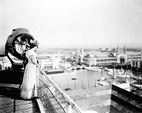
Part of the problem is that these predecessors were mostly ephemeral phenomena, shows and world’s fairs (often shows at world’s fairs) which came and went, which were never designed to last.  Vast fantastical cities would be erected in places like Paris and Chicago, built mostly of plaster meant to look like timeless marble but in fact almost instantly torn down after the fairs closed, leaving only a few durable and poignant souvenirs of the exhibitions they graced, like the Eiffel Tower, for example, which had the good fortune of being made from cast-iron.

Gigantic theatrical spectacles on historical themes, like Buffalo Bill’s Wild West or Imre Kirafy’s “The Fall Of Babylon”, lasted only as long as they drew crowds or their star continued to appear in them.

We have some still photographs of some of these exhibitions and shows, and some bits of film footage from the Edwardian era, but these can’t possibly bring back the color and kinetic dynamism which made such spectacles so appealing to audiences of their time.  The colorful lithographic posters which advertised them do survive, and they give a sense of what they promised their audiences, if not precisely what they delivered to them.

The Water Carnival advertised above was in fact staged under canvas in a large transportable water tank as part of a traveling circus.  I’m sure it was colorful and exciting, but it couldn’t possibly have looked the way it looks in the poster.  It was nevertheless the precursor of the water spectacles staged by Fred Thompson in the gigantic water tank at the New York Hippodrome just after the turn of the last century, which in turn was the precursor of Billy Rose’s “Aquacades”, shows involving athletic swimming events and water ballets staged in outdoor venues a couple of decades later . . . and these in turn were the precursors of the films of Esther Williams made at MGM — indeed, Williams was discovered by MGM scouts while performing in one of Rose’s extravaganzas.

The Williams films were a direct inspiration for the synchronized swimming events in today’s Olympics and, in the commercial sphere, an extravagant water spectacle, O, created by the Cirque du Soleil, is currently on view at the Bellagio Casino in Las Vegas.

Who knew?

The great creators of these spectacles — Kiralfy, Thompson,
who built Luna Park at Coney Island as well as the New York Hippodrome, the
world’s largest theater, on Sixth Avenue in Manhattan,
Steele Mackaye, who helped design and shape Buffalo Bill’s show — are little known today, and their monumental creations have long since tumbled before the wrecker’s ball or rotted away in theatrical storehouses, but they were the fathers of the movie spectacle, the theme park, and the Las Vegas Strip.

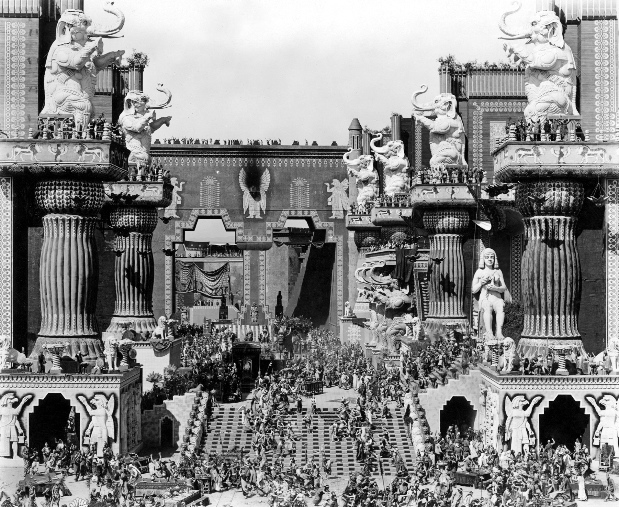
In 1897, Imre Kirafy, choreographer, theatrical producer, stage and world’s fair designer, rebuilt the ancient city of Babylon on a colossal scale on Staten Island, peopled it with 1,500 costumed extras, including, of course, exotic dancing girls, and re-enacted its fall.  The attraction was wildly successful, but survives today only in yellowing newspaper clippings.  Kiralfy has no modern biography and you can only find passing references to him on the Internet and in histories of American theater.

When D. W. Griffith recreated Kiralfy’s recreation on film, in the “Fall Of Babylon” section of Intolerance, complete with exotic dancing girls, he fashioned a modern cultural myth, a seminal moment in the history of cinema, and we can be forgiven for thinking that it sprang full-grown from his imagination . . . in Hollywood, at the corner of Sunset and Vine.  How could we know that Griffith was only working from a tradition of theatrical spectacle on a grand scale that long predated his career in movies?  The origins of that tradition have simply vanished from sight and mind.

CINCO DE MAYO


                                                                                                            [Image by Stevan Dohanos]

Cinco de Mayo is not, as many people suppose, Mexican Independence Day.  It commemorates instead the battle of Puebla in 1862, when a small force of Indian and mixed-blood Mexican soldiers defeated a larger and better-equipped French army during France’s ill-fated attempt to annex Mexico.

It is not a national holiday in Mexico, where it can be observed or not according to the wishes of individual localities.  It is much more universally popular among those of Mexican descent living in the United States, for whom it has become a sentimental celebration of their roots.

Today, for me, it’s a time to grieve over Mexico’s current troubles, its drug-war violence and its struggles with the new strain of flu that has sickened and killed so many there.  The gracious day-to-day civic culture that governs most of Mexico is under siege in a heartbreaking way, and we should all take a moment today to ask that country’s patron saint, La Morenita, La Reina de Mexico, Nuestra Señora de Guadalupe, to show her people a way out of the nightmare.

The time I’ve spent in Mexico has always been magical and inspiring — may it become so once again for the millions of good and kind people who live there.

AU REVOIR, FILMS NOIR

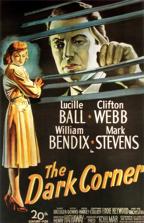
Tony D'Ambra, creator of the ever-useful and ever-interesting films noir blog has decided to call it a day — he's rolling down the Venentian blinds on the site, pocketing his revolver, lighting a cigarette and stepping out into the dark streets to meet his fate alone.

Even though there will be no new posts, I'm hoping he'll keep the archived content online, and the link to his site, over there on the right, will stay up as long as he does.

Tony made invaluable contributions to my own thoughts about the noir tradition, for which I will always be grateful.  His footsteps on the wet pavement, between the pools of reflected neon light, will always echo in my mind.

PENDENNIS

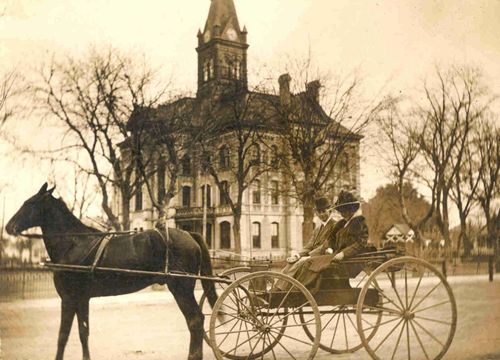
Arthur Pendennis was the protagonist of William Makepeace Thackeray's novel The History Of Pendennis, which appeared in serial parts between 1848 and 1850.  Arthur was a young man of privilege spoiled by an adoring mother who had to learn to make his way in the wider world.  Booth Tarkington gave his name to the Ambersons's carriage horse in his novel The Magnificent Ambersons, and the horse is both shown and mentioned several times in Orson Welles's film of the novel.

Thackeray's Pendennis is obviously related, in terms of character, to Tarkington's George Amberson Minafer, and the horse who bears his name is closely associated with George in several scenes from the novel and the film.  Pendennis is pulling the sleigh carrying George and Lucy Morgan when they pass her father's automobile, stranded on the snowy lane.  “Get a horse!” George shouts just before taking a corner too fast and overturning the sleigh — at which point Pendennis runs off home by himself.

George has already been associated in the film, as a child and young man, with reckless buggy driving, and will become increasingly associated with scorn for the automobile.  The world of the horse and buggy is the world that coddled him and that he doesn't want to end.  He and Pendennis will both be made obsolete by the world the automobile is ushering in.

Pendennis is also featured in the most beautiful shot in Welles's film of The Magnificent Ambersons, one of the most beautiful in the history of movies — the long tracking shot pacing the buggy down the main street of town while its passengers George and Lucy discuss their future, a scene taken from the book.  In both book and film the conversation is one Lucy doesn't want to have, because she can't see a happy outcome to it, and she urges Pendennis to move faster to cut the talk short . . . but Pendennis obeys only George.

Welles moves his camera at Pendennis's speed, for a very long time, drawing us deeper and deeper into the space of the image — into George's world . . . a world that we, like Lucy, already know is doomed.  It's often said that George in Welles's film is too unsympathetic, but the buggy ride that he and Pendennis take Lucy and us on is magical . . . a visceral evocation of a slower and more gracious time.  It's the one scene in the film that I find myself wanting to return to again and again — its beauty is inexhaustible.  While you're on that ride it's impossible not to see things from George's point of view, Pendennis's point of view, to grieve over what's about to be lost, and perhaps even to agree with George that “the automobile had no business to be invented”.

By the same token, when Lucy says, “Get up, Pendennis!” she's talking to George, begging him to get with it, to move with the times — but a horse and buggy, like George, can only move so fast.

[The image at the head of this post is not from The Magnificent Ambersons, but it might well have been — a measure of how effectively the film evoked the world at the turn of the last century.]

NOBODY CALLS FROM VEGAS JUST TO SAY HELLO

The country singer Vern Gosdin has died.  I only knew Gosdin from a couple of duets he did with Ralph Stanley on Clinch Mountain Country.  I should have realized that anybody Ralph Stanley wanted to sing with was worth investigating further but it took Ivan Shreve's appreciation of Gosdin at Thrilling Days Of Yesteryear to get me on the case.

You might say that Gosdin works the same territory as George Jones, with a less distinctive voice — but it's a fine voice, all the same, and Gosdin's choice of material is superb.  Gosdin is, quite simply, one of the great country performers, at his best just over the borderline of despair.  He sings songs for barrooms late at night, in those hours when heartbroken men realize that the beers haven't made them forget anything at all.

I'm partial to one of his songs that's a bit less characteristic, a tale of long-distance heartache and anger featuring my home town — “Nobody Calls From Vegas Just To Say Hello”.  I do wonder, though, why Las Vegas always has to take the rap.  Nobody calls from anywhere just to say hello.

Don't wait as long as I did to check out Gosdin's work — it's great stuff.