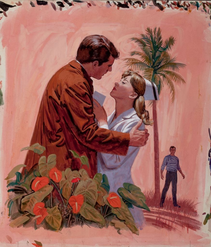
Nurse Transplanted, romance paperback cover, 1971.
The nurse’s face, which is what Koenig wants you to concentrate on, is sharply rendered. Everything else in the painting gets sketchier the farther it is from her face. This became a common technique when the style of story illustrations got looser in the Sixties and Seventies. It mirrored the increased use of shallow focus in movies, often achieved with telephoto lenses, as a stylistic device. It’s subtly done in Koenig’s image, and very effective — you notice the face before you notice the technique — which was not always the case with telephoto shots in movies of the same era.
Click on the image to enlarge.

