Welcome to the day of restless souls . . .
The poster above comes from the ever-astonishing Golden Age Comic Book Stories site. I don't know how he does it, but the proprietor of that site puts up, almost every day, high-res scans of amazing works of popular art, by no means limited to comic book art. There's also a generous abundance of classic book and magazine illustration and promotional art for movies.
Check it out — it's one of the Internet's most consistently rewarding treasure troves.
Category Archives: Art
DAY OF THE DEAD: ALL SAINTS DAY
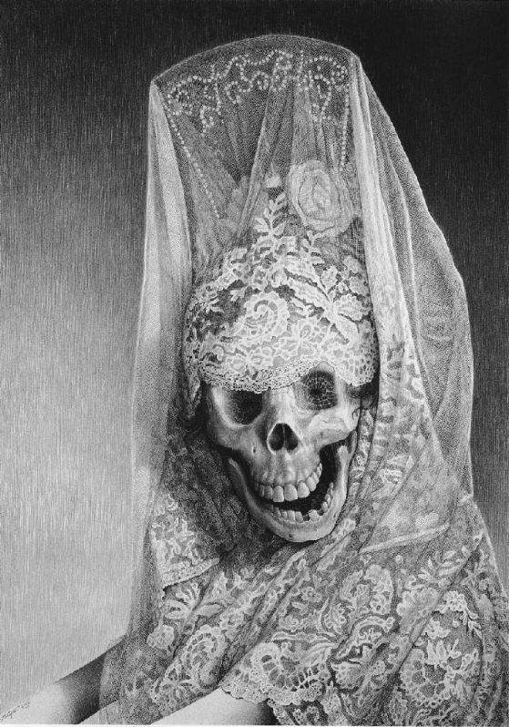
Halloween is over. The kids have gotten their candy and gone home. Now . . . the real days of the dead begin. Not so much fun, not so nice — no more masks, not even the masks of flesh. Laurie Lipton knows who's coming to call now . . .
FRIEDMAN AND LEWIS
The incomparable Drew Friedman salutes the incomparable Jerry Lewis and gives nine reasons why Lewis should get a Lifetime Achievement Award from the Academy Of Motion Picture Arts and Sciences.
Hear, hear!
The drawing is probably reproduced at too small a size to read all the captions, but the images are fun all the same.
ARS GRATIA ARTIS
James Naremore's The Films Of Vincente Minnelli is a thoughtful and illuminating work of criticism but Naremore, like any respectable modern critic, is fixated on the conflict between art and commerce, finding in Minnelli's work for “the dream factory” of MGM a paradigm for that conflict.
But what is this conflict, exactly? When was that golden age when art and commerce were separated? Where was that fabulous Arcadia which played host to artists who worked for the sake of art alone? I cannot find it in history, anywhere I look.
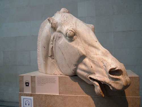
We don't know much about the artists who created the great sculptures of ancient Greece — we have just a few quotes from them. One of them is this — “Sculptors should strive for excellence in their works so they can win competitions and thus earn more money than their fellow sculptors.” This was how the guys that decorated the Parthenon thought about art.
Vincent Van Gogh dreamed fondly of becoming a commercial artist, obsessively collecting and copying magazine illustrations that delighted him. This is how the painter of Crows Over A Cornfield thought about his talent and the uses to which it might be put.
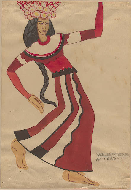
In the 20th Century, Igor Stravinsky said, “There are only two questions a musician should ask — how long should the piece be and how much money do I get paid for it?” This is how the guy who created Le Sacre du Printemps thought about art.
The idea of art for art's sake, as Naremore points out, was created by artists at the dawn of the industrial age, when art began to be thought of as a mass-market commodity. Artists who wanted to separate themselves from the values of the industrial age concocted a pose in which they were somehow above it, just by virtue of being artists. The romance of the starving artist as cultural hero was born with this — starvation being an unknown ambition among artists of the past.
It's all a lot of hooey. There has always been conflict between artists and their patrons, between artists and their audiences. This is built into the nature of art, which navigates a fine line between novelty and familiarity, between challenge and reassurance. The enterprise is hazardous for the artist, who must encompass the paradoxes involved and constantly renegotiate an inherently unstable compact.

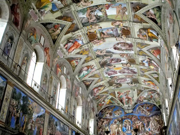
But to see Minnelli's relationship with MGM as somehow different, conceptually, from the relationship of Phidias with the city fathers of Athens, from the relationship of Michelangelo with the Vatican, from the relationship of Bach with his vestry members, is absurd.
Art functions on so many different levels and is so intertwined with the everyday business of life, including commercial intercourse, that the idea of “art for art's sake” makes about as much sense as the idea of “food for food's sake”. The French may think that they appreciate food for food's sake, but what they eat still gets converted into energy and fat and excrement. However sublime a meal may be, it is still an integral part of a most prosaic human process . . . and so is art.
MARIONETTES
Part of the appeal of puppets and marionettes is the contrast of scale they present to the real world. They usually inhabit a smaller version of our world, and are smaller versions of ourselves — but sometimes they inhabit a larger one. Very large puppets, however, generally represent creatures who are “naturally” large, imaginatively speaking — like the dragons in Chinese street parades. Colossal representations of humans occur more often in sculpture, like the Statue Of Liberty, for example.
The colossal marionettes picture here, creations of the French Royal de Luxe street theater company, offer a delightfully witty inversion of the usual inversion. Marionettes, customarily reduced versions of ourselves, here reduce humans to the proportions of marionettes, or even toy soldiers.
I find them unspeakably wonderful.
These photographs, from the Boston Globe's Big Picture site, record a performance at a celebration in Berlin marking the anniversary of the fall of the Berlin Wall. The deep-sea diver and the little girl moved towards each other across the city for a reunion, which offered another inversion — the colossal girl became a little girl again.
For more pictures of this event go here (with thanks to Boing Boing.)
TWO PAINTINGS IN DISTANT PLACES
I traveled a thousand miles north to Wyoming this summer, but mardecortesbaja contributor Paul Zahl (see The Zahl File) and his wife Mary ranged even further afield, leading a religious-themed tour to Russia. (Mary and Paul are personable folks, and Dr. Zahl is a widely respected scholar of religion, so they're much in demand for such tours.) Paul was kind enough to send some reports of his adventures, of which this is the first:
by Paul Zahl
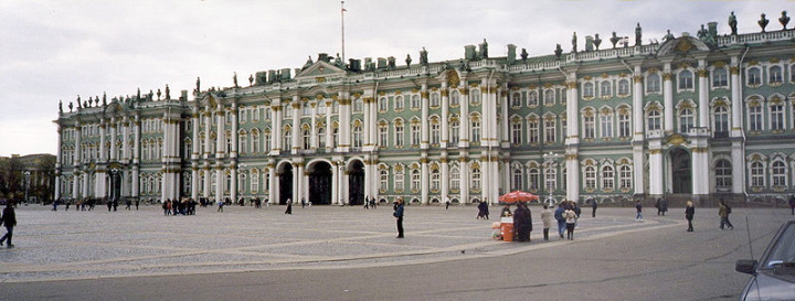
aristocratic French visitor to The Hermitage Museum at St. Petersburg
lectures a young Russian of the early Nineteenth Century concerning a
painting by El Greco (above.) So moved is the Marquis by this painting that he
kneels in adoration before it. He explains to the young Russian that
the picture bears the image of the founders of Christianity, St. Peter
and St. Paul. The scene in Russian Ark is moving and
beautiful.
painting in person. It is in a room full of El Grecos, but it stands
out for its warmth and the humility of one of the figures. The picture
also tells a story familiar to many: the tension between humility and
grace, represented by El Greco's depiction of St. Peter; and doctrine
and the authority of the truth, represented by St. Paul.
Peter is on the left, an old and humbled man of soft features and
tenderness. You could approach him and tell him almost anything about
yourself. He is somewhat sad, sympathetic, and modest. The observer
has to look very carefully to notice that Peter is carrying the key to
the kingdom in his left hand. But that is in shadow, almost obscured.
possessed of his Idea. With his left hand, his left fore-knuckle
actually, he directs our attention to the Word, the Bible before him.
With his right hand, Paul reasons. His features are ascetic,
convinced, sincere, a little detached from persons, but possessed of
his Idea.

Rossellini's television movie entitled The Acts of the Apostles (above),
which treats the same men in somewhat the same way — as two sides of
one thing, the Christian faith. There is even a kind of yellow barrier
between them in the painting, emphasizing their difference.
Paul, his cerebral, reasoning attitude. It is unmistakable. He is
reasoning with the viewer, on the basis of a written text. St. Peter,
on the other hand, is 'reasoning' with us on the basis of a shattered
wisdom, what Dostoevsky called the 'strongest instrument, the humility
of humbled love'. (I know it is pretentious to quote Dostoevsky, but
his words are apt just the same.)
not identify with Peter at the expense of Paul.
Stockholm, and there it was (good God!) — the same painting, by the same
artist, in a room also full of El Grecos. But it was different. The
painting had the same subject, composed the same way, with the same
colors, but something was . . . well, wildly different.
features were pinched, and his hair . . . it was a mess. It was uncombed — what little there was of it was all
over the place.
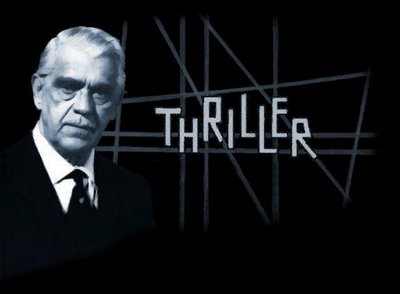
What came to my mind was the episode of
Thriller,the old Boris Karloff television series, entitled “The Cheaters”. At
the end of the episode, a selfish man begins to see himself, through
cursed spectacles, as he really is. The makeup artist, Jack Barron,
first shows the man losing his hair and looking himself but bewildered.
Then we see the man grinning diabolically, with hideous scars on his
face and just a few tufts of hair. Finally, we see the man become a
sort of demon from hell, to which he is soon dragged by the very devil
himself. Fun little episode for schoolboys on a Monday night at nine
way back then.
Paul? His convinced, convicted authority in the Hermitage
version has become transformed into a sort of 'wild man',
'I-just-came-out-of-the-forest-with-Robinson-Crusoe' persona. The
Apostle has entered the Twilight Zone but hasn't come back. Or he is
like the character in a Stephen King story, who is awakened too soon
from a forty-billion-mile journey to a distant planet. Everything's
right but everything's wrong.
Paul” and found nothing on this weird difference. I can't believe it
has gone unnoticed. But it is disturbing.
doctrinal Christianity embodied by the Hermitage Paul, text-weighted
and cerebral, is superannuated. You see it today and you run. The
painter seems to have understood this instinctively. His later St.
Paul has sort of gone crazy. “Grandfather, we need to get you to the
hospital.” This Paul is not Diogenes, an old man of self-contained
de-constructing wisdom. He is a street-crazy — maybe inspired, like the
homeless man in Ordet, who has faith enough to raise the dead,
but you wouldn't take your child to him for a blessing.
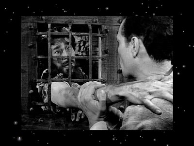
Or, maybe he
is “The Howling Man”, of
benign at all.
St. Paul. But if the Stockholm Paul is the confessional Protestant of the two,
St. Peter is looking pretty good by comparison. And wasn't Senator Kennedy a good
advertisement for that side of the enterprise? [Editor's Note: Paul has elaborated Mary's insight about the portrait of St. Paul into a very provocative meditation. St. Paul wrote some of the greatest and most radical spiritual treatises of
all time, and they were a cry from the heart against law as a spiritual tool — but what he wrote was still theology, and all theology seems to have a
tendency to decompose into law, to be parsed for “rules” which can be
used to oppress instead of bless. A spooky thought occurred to me while reading Paul Zahl's piece — maybe the Stockholm portrait of St. Paul was once an exact copy of the
one in the Hermitage and has decomposed over time, like the portrait of
Dorian Gray, reflecting the historical misuse of St. Paul's letters. The
Twilight Zone, indeed!]
WESTERN BUILDINGS
On our first full day in Jackson Hole several of us made an expedition out to the Lawrence S. Rockefeller Preserve, part of the Grand Teton National Park, to see a new building that John had designed there, the Preserve's visitors' center.
John is an unusual architect and an important one — for several reasons. Although he does world-class work, he has chosen to maintain a primarily regional practice. He grew up in Lake Forest, Illinois and in Hollywood, where his dad worked as a screenwriter, but his roots in Wyoming go back to his teenage years, when his parents bought a large ranch on the Green River south of Jackson. He started his professional practice in Denver but after a few years he moved it to Jackson, where he prospered building homes for the rich and famous attracted to that part of the world, as well as executing commercial and civic commissions in the area. He's carried out commissions elsewhere — including two skyscrapers in Denver — but he's concentrated his creativity mostly on local projects.
He decided early on to go his own way, designing buildings that pleased him and pleased his clients, rather than ones that followed the tiresome architectural fashions of the day, which for much of the 20th Century favored severe, multi-useless spaces.
His buildings echoed a frontier style, rustic and simple, often borrowing elements from the grand park lodges of the Teddy Roosevelt era, with a dash of Frank Lloyd Wright's Japonisme, but he never indulged in pastiche. He created complex and inviting spaces that were in a kind of dialogue with the big skies and grand vistas of northwest Wyoming. Like the simplest log cabins from pioneer days, his buildings have the quality of refuges, but they also have the wit and daring of a more contemporary style. I don't know any other buildings quite like them.
Now, of course, the architectural establishment that he mostly ignored has discovered him, and recognized his work with various awards. The visitors' center at the Rockefeller Preserve was a very prestigious commission, which John's firm won not because he was “local” but because John's design was stunning. Stunning but simple, revealing its magic subtly.
Look at the picture of the structure at the beginning of this post, which records the view of it you get approaching it on foot from the parking lot. It may, at a first, casual glance, seem like a utilitarian farm building, until you notice the elegant curved and slatted front, which projects the building forward into space . . . quietly.
Coming closer, you discover thin metal struts distributing the weight of the roof in surprising ways and also adding an “abstract” (though eminently practical) design element. The building also appears at first to be more or less rectangular and self-contained, but on approaching closer a wing behind it is revealed, attached at a right angle, creating a court-like space in the V between the wings, with a porch (pictured above) that further defines the implied court.
The building's design is distinctly modern in many ways, but it looks as though it's always been there — instantly part of the history of the park. It fits in to the continuum of frontier building, but carries it forward. It's neither highbrow nor lowbrow, neither modern nor post-modern, neither ironic nor nostalgic — it's just great. Like all great art it establishes its own category.
We walked away from our visit to the building enlightened.
The ability to create with space is one of the weirdest of all artistic gifts — weird because there's no language quite precise enough to describe its processes or its results. This is true of dance and sculpture and cinema as well as of architecture. We can talk clearly about the five positions of classical ballet, about the techniques of carving wood or marble, or casting in bronze, about the strategic choices involved in positioning or moving a motion picture camera in space, about the ways and means by which a building is constructed, but the link between these things and the way they can make us feel is elusive, mysterious.
And this is finally very odd, because the mystery is connected to things about space that we know very intimately, if unconsciously, from everyday life — from dancing, from playing sports, from the rituals of courtship and lovemaking, even from driving on crowded highways. Artists who create with space are telling us things we know without knowing.
Nothing I could write about John Carney's Western buildings could possibly convey what it actually feels like to move around and through them. Their spaces can't be “quoted”, like the words of a text or a phrase of music — they can't be “reproduced”, even crudely, on a page like a painting or a work of graphic art. In the end, you just have to go up to Wyoming and walk around and through them yourself.
AN ARTHUR RACKHAM FOR TODAY
From the ever-amazing Golden Age Comic Book Stories — new stuff almost every day, so much more than comic books, one of the Internet's most astonishing purveyors of visual delight.
A TISSOT FOR TODAY
Paul Zahl (of The Zahl File fame) recently sent me a postcard of the Tissot painting above, called “The Ball On Shipboard”. It was done around 1874 and is now in the collection of The Tate Gallery in London.
It was, I believe, the first Tissot I ever saw, reproduced in a book. It was certainly the first Tissot that took my breath away, with its intricate progression of spaces leading the eye deeper and deeper into the image, starting with the figure of the young lady seated in the foreground and seeming to look into the viewer's space, on this side of the picture frame. Then groups of figures lead us back over the main deck and down to the dancing on the deck below and finally to the wide view of the harbor over the ship's rail.
We are left with a sense that we have moved through these spaces physically — that we have attended this ball rather than just seen a picture of it.
UNSPEAKBLY COOL
A couple of Christmases ago my sister gave me the remarkable object pictured above. It's a hollow ceramic pumpkin in which a funeral scene is being enacted. A woman holds her head and weeps, another throws herself upon the coffin of the departed, another seems to be eating bread, while a man supplies music on a guitar. All of the figures have skull faces — this is, of course, a dia de los muertos diorama. There is fresh food laid out for the spirits of the dead.
The pumpkin rests on a cone base made of hundreds of pink button sewn together.
My sister found it in an eccentric toy shop in Los Angeles. The proprietor had bought it years ago in Mexico — he believed it to be about a quarter of a century old. It was made by a man named Alfonso Castillo from Izúcar de Matamoros, Puebla, Mexico, in the southern part of the country. Mr. Castillo is apparently part of a large family of artisans from that region — here's a picture of him at work:

Mr. Castillo's dia de los muertos pumpkin had sat in a case in the toy shop for ages, much admired but never purchased, until my sister had the good sense to snag it.
It's one of the coolest things I own.
A NEW YORKER CARTOON FOR TODAY
From the 80s, I think.
Booklovers will understand the meaning of this. I sometimes seek, and in fact currently possess, imaginary books.
McSORLEY'S
And malt does more than Milton can
To justify God's ways to man.
— A. E. Housman
The great caricaturist Drew Friedman recently designed the label above for one of McSorley's house brews. McSorley's, in downtown Manhattan, is the oldest continuously operating bar in New York, going strong, or at least going, since before the Civil War. It has a special place in my heart, for it was there I began my lifelong love affair with beer.
In 1968, I spent the summer of my 18th year in the East Village, NYC, in an apartment near McSorley's. The bar had not at that time been adopted by NYU frat boys, and was a dive, little changed from the 19th Century. Old, grizzled men, many of them retired merchant seamen, hung out there in the afternoons drinking the fine house ales and filling up on the cheap sandwiches sold at the bar. The drinking age was 18 back in those days, and my friends and I hung out there in the afternoons, too. It was a grubby but magical place. It looked exactly the way it looks in the 1912 painting below by John Sloan:
Women were not allowed in McSorley's then — a 19th-Century policy that would soon be challenged by feminist activists. The first of them who walked in and demanded to be served got a pitcher of beer emptied over her head. The courts eventually ruled that McSorley's could not legally bar women. This opened the way to its current status as a hipsters's joint. It still looks the same as it always did but cannot be visited by sane people at most hours of the day and certainly not after dark.
I'm glad that women are served there now, of course, and its popularity will insure its survival for another century or so, but the hiraeth comes upon me when I think of it as it was once — the hiraeth, a Welsh word that means “the longing for what has been”.
The quote above (thanks, Django) is from a poem by Housman called “Terence, This Is Stupid Stuff”, which also contains the following lovely lines:
Oh I have been to Ludlow fair
And left my necktie God knows where,
And carried half way home, or near,
Pints and quarts of Ludlow beer:
Then the world seemed none so bad,
And I myself a sterling lad;
And down in lovely muck I've lain,
Happy till I woke again.
A CLOWN FOR TODAY
. . . with two bonus clowns included free — all you pay is shipping and handling.
[Thanks to The Gunslinger for the image.]
AN AL MOORE PIN-UP FOR TODAY
. . . change you can believe in.
AMERICA, AMERICA
Keep your eye on the ball, baby.
[Post cover by Dick Sargent]
