SERUM TO CODFISH COVE (PAGE ONE)

The legendary Carl Barks drew Donald Duck comics for about 25 years starting in 1942.  He didn’t have a spectacular graphic style — what he did have was a stunning narrative efficiency, great imagination and irresistible charm.

This is the first page of a story published in 1950 called “Serum To Codfish Cove”.  I found it on Rodney Bowcock’s Comics and Stories blog, which Mr. Bowcock has sadly just abandoned.  It was a great site.  In his introduction to this story, Mr. Bowcock observed that it would have taken another comic-book artist at least twice as many images to tell the same tale.  In Barks’ hands it just flies along, without ever seeming rushed or abbreviated.  It’s also great fun.

I’ll be posting the whole thing (ten pages in all) as a tribute to Barks and to Mr. Bowcock, whose blog will be missed.  I wish I’d taken the time, back when I had the chance, to tell him how much I enjoyed it.

VAN ALLSBURG AND PARRISH

I'd never really noticed it before but Chris Van Allsburg's illustrations seem to owe something to the black-and-white illustrations of Maxfield Parrish:

Same diffusion in the surface treatment, same bold modeling of solid forms beneath it.  In terms of composition, Parrish was attracted to tableaux, which gives his images a flavor of the theater, while Van Allsburg uses more dynamic angles emphasizing spatial depth, which feels more cinematic.

BIRD'S-EYE VIEW

Artists working for periodicals in the last century were always attracted to the bird's-eye view — it grabbed attention and allowed for a complex image, often with lots of little stories or anecdotes unfolding within the frame.  Dudley Fisher did a regular newspaper comic based on the bird's-eye view — the page above is from 1939.

Stevan Dohanos did the Saturday Evening Post cover above in 1954 with a similar subject but in a photo-realistic style.

Tony Sarg did a wonderful series of bird's-eye views of New York in the 1920s, which have recently been collected in a book, Up & Down New York.  (You can get it here.)  Sarg was a fascinating figure from the first half of the 20th Century — primarily a theatrical puppeteer, he branched out into children's books, films and advertising displays.  His most lasting contribution to American visual culture was probably his invention, in 1928, of the Macy's Thanksgiving Day Parade balloons — versions of his popular marionettes but manipulated by lines from below.

MEAD SCHAEFFER

American illustrator Mead Schaeffer, a contemporary of Norman Rockwell, was strongly influenced by N. C. Wyeth, from the generation before theirs.  In some of Schaeffer's illustrations for classic books he almost seems to be trying to impersonate Wyeth:

Most of the time, though, he used a lighter palette and line (or a more impressionistic treatment of the surface of the image) to soften the bold, solid modeling of figures and forms that characterized Wyeth's illustrations, while still evoking the Wyeth “look”:

During WWII, for The Saturday Evening Post, Schaeffer did a series of portraits of soldiers with picturesque jobs which relied on a photo-realistic technique, dramatized by extreme angles — like the image of the aircraft-carrier signalman at the head of this post, and of the naval-convoy lookout below:

These portraits seem to owe more to the graphic style of propaganda posters than to the more complex narrative strategies of many of the artists who did Post covers in this era.

JOHN FALTER


I've always loved Norman Rockwell — passionately — especially his Saturday Evening Post covers.  His little narratives and character studies were accomplished with techniques I associate with cinema practice from the golden age of the Hollywood studios — a photo-realistic look subtly theatricalized by carefully controlled lighting, expressive “set design” and compositions that emphasized the depth, or stereometric quality of the image.  He made pictures you could get lost in, on a formal level, just long enough to imaginatively inhabit the environment in which his stories unfolded.

What I'm only coming to realize is how many other artists there were who pulled off the same kind of miracles on Saturday Evening Post covers.  None of them quite duplicated Rockwell's technical bravura, but they came close enough to be enormously effective storytellers in their own right.

I've written before about Stevan Dohanos, but John Falter was in the same league.  He could tell Rockwell-like stories about the ordinary rituals of American life that still resonate today with something more than nostalgia:

He also did a series of double-page views of American cities — covers that folded out to twice the size of the magazine — like the one at the head of this post.  These told a different kind of story — summoning up the life of a city in the bustle of one of its signature spaces, seen in long-view.  The one above, of the square in front of the Plaza Hotel in Manhattan, at 59th & 5th, makes New York look toy-like and manageable — and that's the way it sometimes feels in that elegant square, which mediates between the monumental and the human scale of things.

[Clicking on the double-page image of New York (or here) will take you to a high-res image at The Visual Telling Of Stories web site, where I found the cover — worth examining in detail for all the little stories unfolding within the wider view.]

JULES GUÉRIN

Jules Guérin was one of the most famous American artists at the beginning of the last century.  He illustrated books but also executed important public commissions, like the murals for the Lincoln Memorial in Washington, D. C.

He had a curious style — a delicate sense of color and design, influenced by the Art Nouveau movement, married to a very rigorous draftsmanship.  As a design, the image above has something of the abstract quality of a Japanese woodblock print, yet it still seems to be an authoritative record of the look of the Manhattan skyline in a mist.

Guérin's color sense led to his being hired to design the color scheme of the Panama-Pacific Exposition in San Francisco in 1915, controlling every color choice throughout the fair, including the roofs of buildings and the uniforms of the guards.  This was a break from the “White City” aesthetic of American world's fairs, established at the Chicago exhibition in 1893.

His superb draftsmanship, on the other hand, kept him busy doing renderings for architects and town planners to showcase their proposed building projects:

You won't see his paintings on the walls of your local art museum, which is and apparently always will be committed to showing you cutting edge art (more specifically, art that was considered cutting-edge around 1965), and there are no books dedicated to his work.

But he's no longer lost — thanks to the Internet.  The images on this page come from various places, including a wonderful site that hosts vintage American illustrative art, Golden Age Comic Book Stories, centering on comic books but with a good sampling of classic American illustrators as well.  Its latest post reproduces all of N. C. Wyeth's illustrations for Jules Verne's Mysterious Island — a really stunning collection of images.

A STEVAN DOHANOS FOR TODAY

Artist Stevan Dohanos was a contemporary of Norman Rockwell and generally worked the same territory — realistic images that depicted touching or amusing anecdotes, mini-narratives, about American life.  Dohanos didn't have, or wasn't interested in, Rockwell's virtuosic technique, which gave Rockwell's images the quality of supernaturally perfect photographs, but he had great graphic style and knew how to use realistic evocations of space the way Rockwell did, to create drama and lend his images an emblematic, theatrical (or perhaps one might say cinematic) appeal.

Dohanos, like Rockwell, often painted covers for The Saturday Evening Post, and they're quite wonderful.  Above is one of them, from 1948.

[With thanks to American Gallery for turning me on to this delightful artist.  The image itself comes from an extraordinary site devoted to visual storytelling in the graphic arts — VTS (The Visual Telling Of Stories) maintained by Chris Mullen.  It's one of the Internet's greatest cultural resources.]

THE FUNNY PAPERS: TERRY AND THE PIRATES, 1934

The adventure continues — into and out of the Dragon Lady's clutches . . . but for how long?

Caniff is great at setting up action sequences with static, tableau-like panels.  Also, check out the dynamic cut between the fourth-from-last panel and the third-from-last panel — the socked pirates flies left, Terry and Pat jump right.  For a subtler effect, notice the slight change of expression on the Dragon Lady's face between the next-to-last panel and the “cut-in” to the last panel, giving the impression that you've actually seen her lips move . . . just a bit.

A CURRIER & IVES PRINT FOR TODAY

The temperatures are inching up into the 90s out here in the Mojave Desert, a harbinger of the furnace-like heat that's on its way . . . making it a good time to pause and contemplate a Currier & Ives winter scene.

Orson Welles was clearly trying to evoke Victorian prints like this in the sleigh-versus-automobile episode in The Magnificent Ambersons.  He may even have had this particular print in mind, with its rider tumbling from the overturned sleigh and the snowy road winding off into the distance under the bare tree branches.

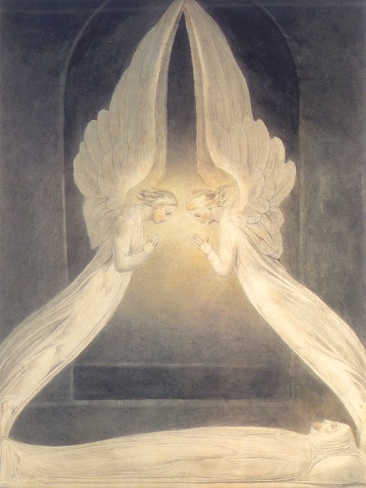
HOLY, HOLY, HOLY

“What,” it will be Question'd, “When the Sun rises, do you not see a
round disk of fire somewhat like a Guinea?” Oh no, no, I see an
Innumerable company of the Heavenly host crying, 'Holy, Holy, Holy, is
the Lord God Almighty.'

                                                                                  — William Blake

JULIUS LEBLANC STEWART: A VICTORIAN PAINTER YOU SHOULD KNOW

Julius LeBlanc Stewart, whose work I discovered via Femme Femme Femme, was an American artist who studied and worked mostly in Europe.  He was a pupil of Jean-Léon Gérôme and Raimundo de Madrazo.  He absorbed Gérôme's technical skills, to a degree, but generally followed de Madrazo in his choice of subjects, contemporary interiors and portraits, mostly of women, that usually featured a sensual treatment of fabrics.  These portraits remind one strongly of John Singer Sargent's and are often very fine:


Stewart, like Sargent, was a late Victorian — he lived until 1919 — and like Sargent was attracted to the free brush-strokes of the Impressionists, always allied, however, with a rigorous academic draftsmanship and a concern for the evocation of space for dramatic effects.

Like many Victorian academic painters, Stewart sketched very freely, with an eye to the surface effects of paint on canvas, preserved in a limited way in the more finished work he exhibited.  Degas struck a different balance between sketch and “finish”, but the dynamic was exactly the same.  Below is a Stewart sketch:


He did a series of nudes in outdoor settings that evoked mythological subjects, but only
nominally.  They have the frankness and the contemporary feel of Anders Zorn's very similar scenes:


Like Tissot, Stewart loved the spatial dramatics of figures on ships, as with the painting at the head of this post.

The late Victorians influenced by Impressionism but still not seduced away from academic formalism constitute a fascinating group, though Sargent is the only one of them who has any kind of reputation today, alas.