WINSOR MCCAY AND THE CINEMA

The
influence that went on, back and forth, between the cinema and other
visual arts has often been noticed but rarely studied in detail. 
Writers on cinema have produced tome after tome about the influence of the
stage and literature on movies, but the visual side of things has
rarely been subjected to rigorous investigation.

Partly this is because the two principal visual influences on movies,
comic strips and Victorian academic painting, have had little prestige
in the scholarly culture, and partly it's because these two forms have
been hard to study themselves.  First-rate reproductions of even
the most important comic strips have been difficult to come by, and
Victorian academic painting tends to languish in storage in museums, to
make room in the galleries for the junk creations of “modern art”.

With respect to comic strips, things are changing.  Splendid reproductions of seminal strips like Popeye, Gasoline Alley and Terry and the Pirates
are becoming available in ongoing series, and Winsor McCay is getting
spectacular treatment in large over-sized volumes which do full justice
to his amazing visions. (See here and here.)

New revelations about the connection between comic strips and movies should
follow.  Here's a brief slideshow (via Boing Boing) created by a critic at the Boston Globe
which surveys some of the most obvious ways Winsor McCay's work has
influenced the iconography of movies.  It's based on observations in a new collection of McCay's strip Dream Of the Rarebit Fiend.  More complex issues of
narrative technique and composition will surely come to the fore in the
future.  [McCay created some of the earliest animated cartoons, so
his influence on film animation has long been appreciated, but his
influence on movies in general was far more comprehensive, as the
slideshow suggests.]

If you want to contemplate the connection between cinema and Victorian
academic painting you will just have to settle at present for my
passing observations in the essays collected here.

EMILE FRIANT: A VICTORIAN ARTIST YOU SHOULD KNOW

Émile Friant painted portraits and scenes of the French countryside.  He
had, to me, a decidedly cinematic eye — his genre paintings are not
sentimentalized and they have a bold, dynamic quality based on spatial
compositions of great though subtle power.  They remind me of Bertolucci’s
images in 1900.

The painting above uses a technique Tissot was fond of — creating a
space in the foreground that instantly occupies one’s attention but
which also opens up into a deep space beyond.  Spaces opening up
into deeper spaces instantly summon up the idea of movement, of the
potential for movement — they almost produce a sensation of movement.  This
and their photorealistic quality are what to me give them a cinematic
quality.

Friant was a late Victorian — he lived until 1932, well into the era
of the Impressionist triumph.  Like John Singer Sargent he
borrowed a freer approach to brushwork from the Impressionists while
remaining true to the basic aesthetic ideals of the Victorian academy.

LORD LEIGHTON: A VICTORIAN ARTIST YOU SHOULD KNOW


Lord Leighton was generally considered the dean of Victorian academic painters.
He combined the decorative stylization of the early Pre-Raphaelites with a more photo-realistic draftsmanship, an approach which made his work popular with a wide public and influential among his fellow painters.

The painting above, exhibited in 1855, caused a sensation and
established his reputation.  An enormous, 17-foot-long work
depicting a procession in Renaissance Italy, it was admired by Queen
Victoria, who bought it.

Leighton also did works in a style that might be called magical
photorealism, like the one below, which reminds one of similar images
by Bouguereau:

He could also, like Bouguereau, be frankly sensual in a more naturalistic mode:

Like Alma-Tadema he did vexing evocations of the ancient world:

His historical paintings could have strong narrative and theatrical qualities, like this one, Dante In Exile:

On top of all that he produced some fine portraits, like this famous image of the explorer Sir Richard Burton:

All around, Leighton was really cool.

A WATERHOUSE FOR TODAY

You could get lost in the spatial complications of this painting, Destiny
by John William Waterhouse, which take a while to sort out.  The
sorting out is part of the artist’s strategy for drawing you into the
image — as the female figure’s dream of the adventures those ships
could take her on becomes your own.  For her the ships are reflections
in a glass, for you they’re paint on canvas — dreaming makes them both
real.

FROM CANVAS TO SCREEN

Here is Anders Zorn at his most academic.  The composition offers a dramatic illusion of deep space, with an optical integrity which evokes the photograph — but it’s all inflected with the suggestion of narrative, as we’re invited into the darkened area just off the ballroom where private intercourse is taking place.

And yet for all this we still have Zorn’s delightful treatment of the
surface of the canvas, with its sensual strokes reminiscent of the
Impressionist style, its magical ability to render the subtlest play of light.


The total effect can only be described as cinematic — and wouldn’t it
be nice if cinema offered more images as exciting as this one, visually
and plastically?


I think it’s possible that this image was in the back of D. W. Griffith’s mind when he composed the shot below from Intolerance, with its own darkened area just off a ballroom that opens up brightly behind it:

As I’ve written before, we tend to see early film as a medium emerging
from the Victorian stage, but Griffith himself wrote this about Intolerance:


“You will see the world’s greatest paintings come to life and move and have their being before your eyes.”

The important thing to remember is that painting itself, even before
the invention of movies, was aspiring to the condition of cinema.
The spatial depth of Zorn’s image, its desire to evoke movement in
space, found a kind of fulfillment in the cinema, especially in the
cinema of D. W. Griffith.

JOHN WILLIAM WATERHOUSE: A VICTORIAN ARTIST YOU SHOULD KNOW

Actually, if there’s a Victorian artist you do know, it’s probably John William Waterhouse.  Prints of his paintings are quite popular, and it’s not hard to see why.  He
combines the dreamy Romanticism of the Pre-Raphaelites with a bold
modeling of forms and an optical integrity that suggests a nearly
photographic realism, however free his treatment of the paint surface.

His process seems to have involved a strict linear draftsmanship to
which he applied sketchy strokes of paint as he worked out the color
scheme of the final image.

He then blended the colors into more modeled forms for the finished
work, but retained something of the freshness of his sketches.

Impressionism was a stage in his process, never an end in itself.
His primary goal was narrative suggestiveness and the creation of a
world, theatrical as it might be, which convinced the eye with the
illusion of space and stereometric forms.  Note the sharp relief
of the figures in the painting at the head of this post and the
sketchier view of the coast behind them.  The contrast of
treatment itself creates a sense of deeper space.


Andrew Lloyd Webber owns the painting below.  I’d have bought it, too, if I had his resources — it’s just miraculous:

AN ALMA-TADEMA FOR TODAY


The title of this painting is Unconscious Rivals,
implying a narrative content that isn’t really apparent in the work
itself but suggesting how Alma-Tadema’s imagination worked.  He
wanted to present the ancient world as brand new, almost
photographically convincing in visual terms, and to people it with
humans exactly like ourselves, as opposed to classical emblems of
virtue or vice.  In this he was following the classical style more
closely than some of his neo-classical peers in 19th-Century art.
Even when Greek sculptors in antiquity were depicting mythological
beings, they always endowed them with an essential humanity just as
vital as their symbolic personae.

The play of light in this painting is magical yet perfectly naturalistic, and I
love the way Alma-Tadema has obscured our view of the distant sea,
which only makes us look deeper into the space of the painting to
register it.  It also makes us imagine walking up to the railing
for a better view — drawing us into the foreground space as we imagine
navigating it.

A TISSOT FOR TODAY

The porch and table with figures creates its own space, echoed in the space
of the pier with figures behind it, drawing our eye deeper into the
image, to the spars of the docked ship, the buildings and the course of
the Thames winding into the distance.


The girl, the captain’s daughter of the painting’s title, looks in the
other direction, counterpointing our attention.  We feel that if
we just turned our heads we would see what she’s seeing.


We’re not simply looking at something — we’re inside the painting . . . we’re somewhere.

ANDERS ZORN

Recently, thanks to Amy Crehore’s blog Little Hokum Rag, I discovered the work of the amazing Swedish painter Anders Zorn.  Zorn started his career in the Victorian era and his paintings share some of the attributes of the Victorian academic schools — an almost photo-realistic style combined with an emphasis on the dramatic use of spatial depth in the image (see above.)

But Zorn worked into the first two decades of the 20th-Century and like Sargent, another quasi-academic, he was attracted to the free brushstrokes and painterly surfaces of the Impressionists.  Indeed, some of Zorn’s wonderful  portraits of women can stand favorable comparison with Sargent’s work:

Like Gérôme, Zorn’s interest in stereometric forms led him to work also in the medium of sculpture:

Zorn was justly celebrated for his images of water, in which the sensual brushstokes render with convincing precision the surfaces of sea or river or lake:

Zorn is perhaps most famous for his plein air nudes.  In them he abandons any hint of the allegorical or classical, which tended to inform the Victorian academic approach to the nude, for a frank celebration of the female body in a natural setting.  I wouldn’t be at all surprised if these nudes influenced Andrew Wyeth’s portraits of naked women out of doors — which have the same sort of directness, as though we, the viewers, had simply stumbled upon a woman walking around naked through the woods:

There’s a hint of the voyeuristic in the approach — you get a sense that Zorn’s models might be startled (though perhaps not embarrassed) to find someone looking at them.  The image below seems to reflect something of Zorn’s attitude — seen from behind, one of his models appears to be disrobing for him out of doors, or getting dressed again after posing, but Zorn appears to be spying on her without her knowledge.  There’s no sense of violation — just of a secret delight.

I think it’s one of the sexiest images in all of art:

ISLE OF THE DEAD

Above is an amazing image by the 19th-Century Swiss symbolist painter Arnold Böcklin — Self Portrait With Death.  I stumbled across it while looking for another Böcklin painting, The Isle Of the Dead, which Hitchcock reportedly used as a visual frame of reference for Vertigo.

The Isle Of the Dead (below) is almost as spooky as the self-portrait, and while it’s not referenced directly in Vertigo, its mood and basic visual strategy obviously informed a lot of the film’s compositions involving Madeleine, the ghostly, morbidly-obsessed heroine, who often appears as a distant, deathly-still figure set against backgrounds of dark trees and the sea.

SIR LAWRENCE ALMA-TADEMA: A VICTORIAN ARTIST YOU SHOULD KNOW


Sir Lawrence Alma-Tadema might be the most ravishing of all the Victorian academic painters.  His luminous photo-authoritative images of the ancient world are sensually and historically seductive — they seem to lay antiquity before us as it might have appeared in real life were we to be magically transported back into it.

In truth his visions are romantic, concentrating as they do on sunny Mediterranean light, color, luxury and spectacle — but they convince the eye.  His preoccupation with the illusion of spatial depth draws us imaginatively into the scenes he conjures up, gives us a visceral sense of participation in them.


The tradition of the Biblical epic in cinema pursued Alma-Tadema’s aims by other means but rarely achieved them with such magnificent authority.  The chariot race in Wyler’s Ben-Hur perhaps comes closest to involving us in a vision of the ancient world that possesses a comparable enchantment and illusion of truth.


Wyler, and second-unit director Yakima Canutt, who actually supervised most of the filming of the chariot race, used the tracking shot in spectacular ways to draw us into the cinematic universe of the sequence.  A camera moving through real spaces, photographing real people driving real chariots was a powerful tool, but in a way its very power highlights the effects Alma-Tadema was able to achieve with just paint and canvas.

He was fine painter, as well as a fine storyteller — the study below gives a good idea of his purely painterly gifts, scarcely inferior to Degas’, for example:


The 20th-Century art establishment became suspicious of the meticulous “finish” the academic painters gave their works, but the über-photographic illusion they were after, and the narrative ambitions it served, remain potent and charming.

VICTORIAN ART AND THE CINEMA

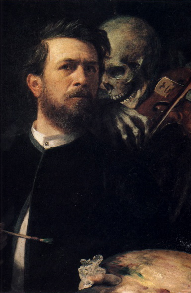
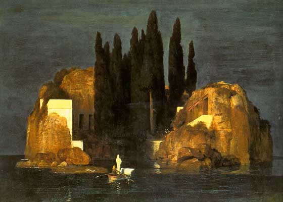
In the mythology of modern art history the realist painters of the
Victorian era fought a losing battle with the photograph and eventually
capitulated to the dominant aesthetic of 20th-Century art, with its
irresistible (and progressive) trend towards a greater and greater
abstraction, abandoning both pictorial realism and almost all narrative
ambitions.


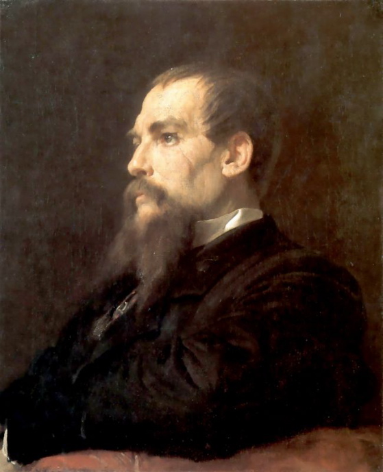
In fact, however, realist painters of the Victoria era conducted an
exciting and productive dialogue with the photograph, incorporating its
apparent authority but also, at the same time, extending its range of
representation beyond the technical limits of the 19th-Century camera.


Academic art surrendered not to the abstractions of the 20th-Century
painter but to the great artists of the early cinema, who assumed the
narrative and representational ambitions of academic art in a medium
which had, at least as far a popular taste went, better resources for
realizing those ambitions.  You could almost say that the academic art
of the 19th-Century was born again, gloriously, in a new medium, which
it deeply influenced.


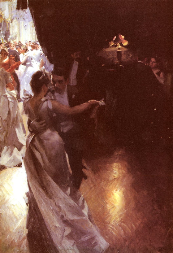
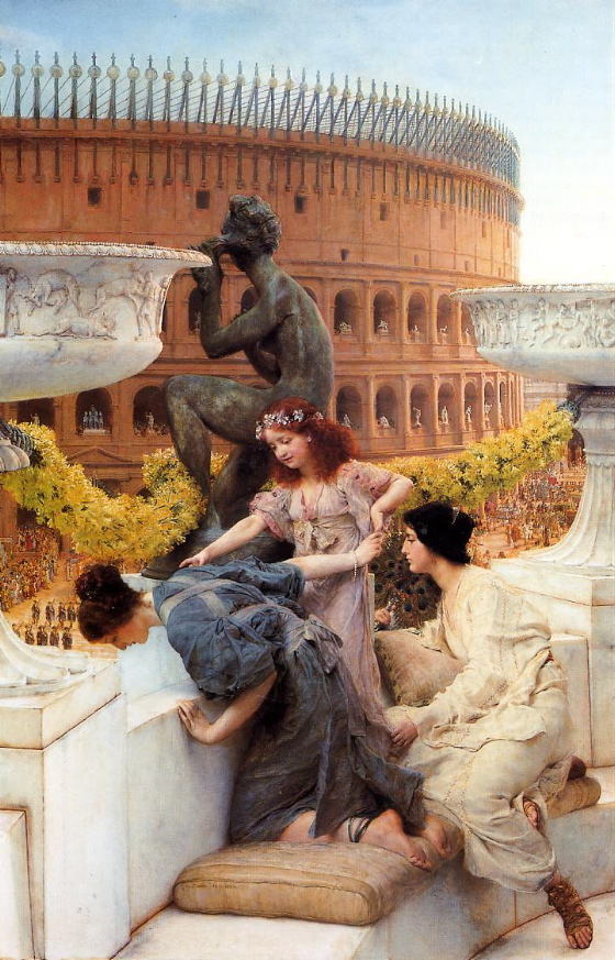
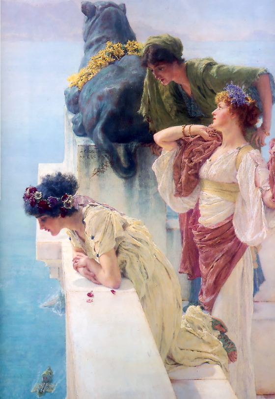
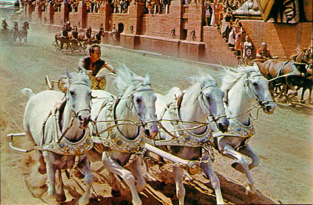
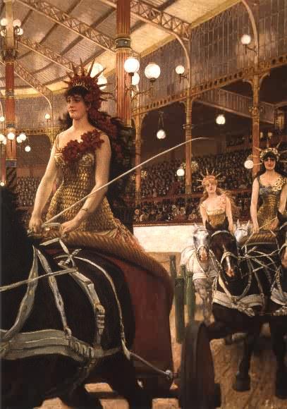
Academic art taught movies how to orchestrate photo-realistic elements
into theatrical forms, using lighting, framing and the placement of
figures in space to create a hyper-realistic illusion that had the
coherence of actual visual experience even when departing from it in
fabulous ways.  Because film could capture motion, and thus emphasize
the plasticity of space far more expressively than the easel-painter,
it rendered the academic easel-painter’s art passé.  It was motion and
the greater illusion of spatial depth it allowed which lost academic
art its popular following.


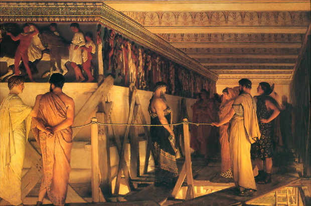
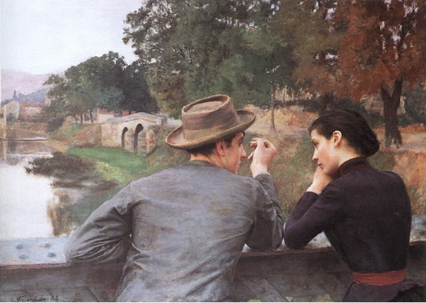
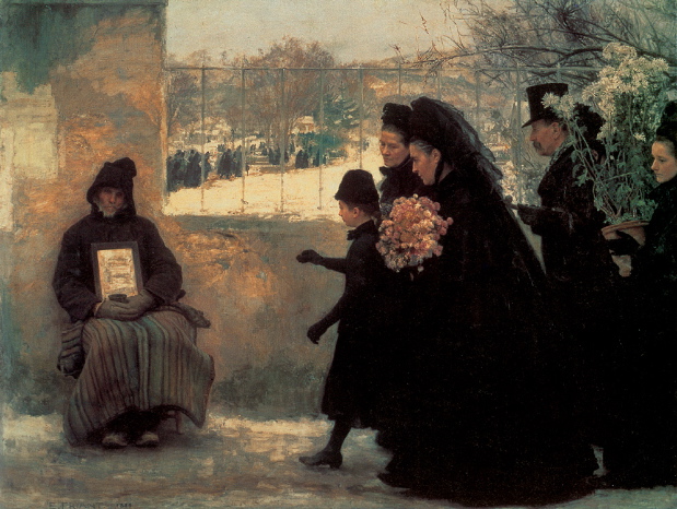
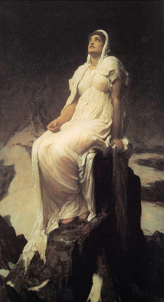
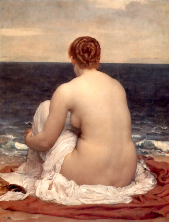
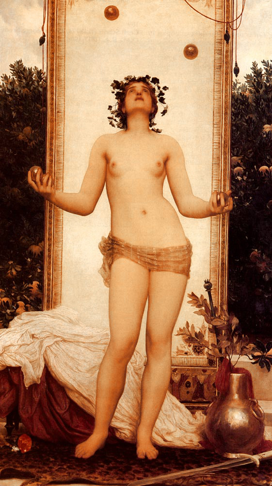
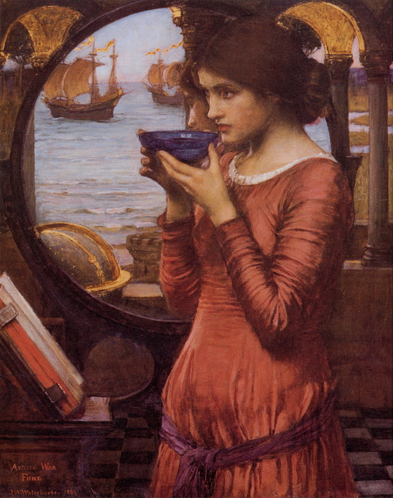
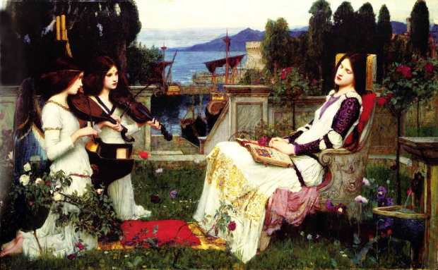
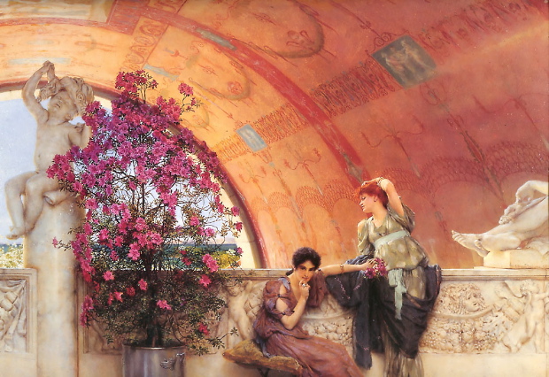
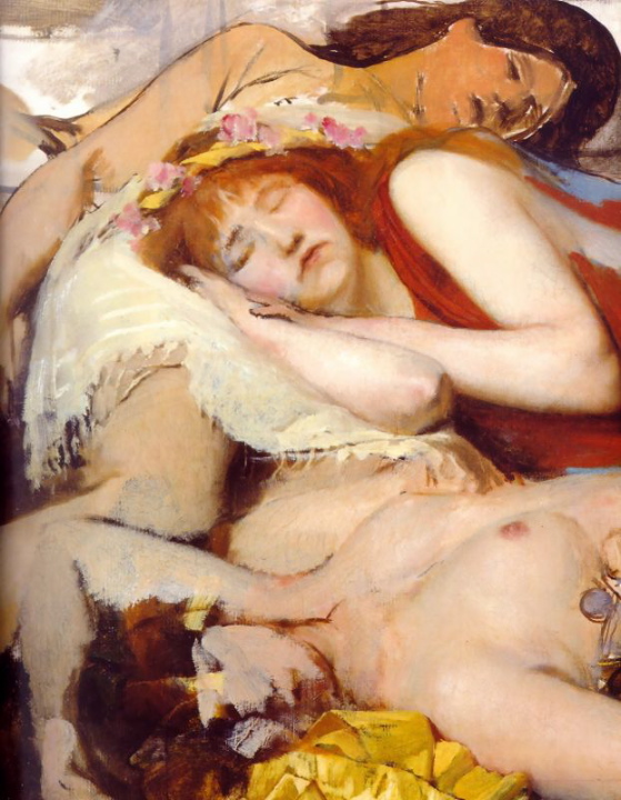
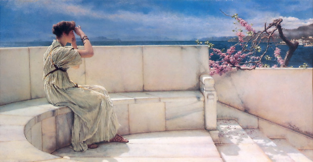
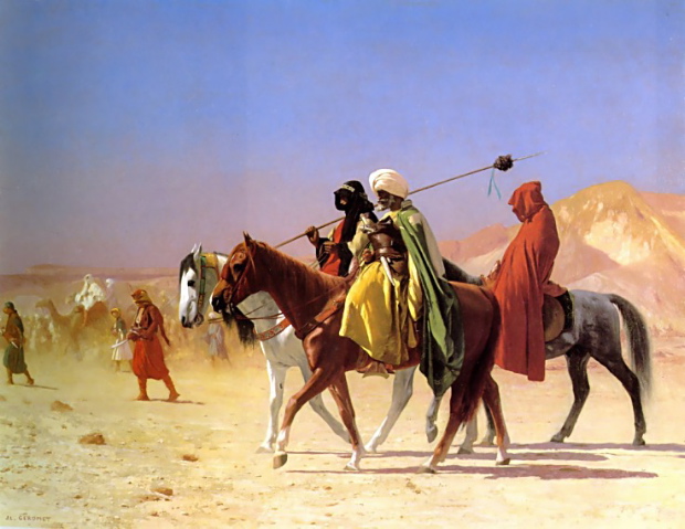
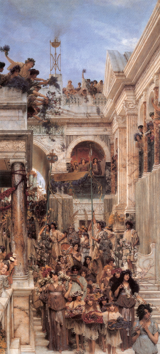
But much more than that was lost, especially in the realm of color.  Up
until very recent times, color film stocks couldn’t begin to reproduce
the range of lighting conditions which the Victorian realist painters
gloried in.  By marrying, through draftsmanship, an almost photographic
realism with an über-photographic sensitivity to color and light, the
Victorian painters anticipated cinematic effects which remain difficult
to achieve even today.


The attempt to devalue the work of Victorian painters, seeing them as
obstinate blocks to the steady progress of art, was a strategic ploy on
the part of 20th-Century modernist painters and their apologists in the
academy and the marketplace.  Engaged in a project which would divorce
art from popular taste and arrive at an aesthetic dead end before the
end of the 20th century, they posited a straw man in the person of the
reactionary academic practitioner which lent their own schools an
undeserved glamor and prestige — even as the academic practitioner was
informing and inspiring the great new popular art form of the movies.


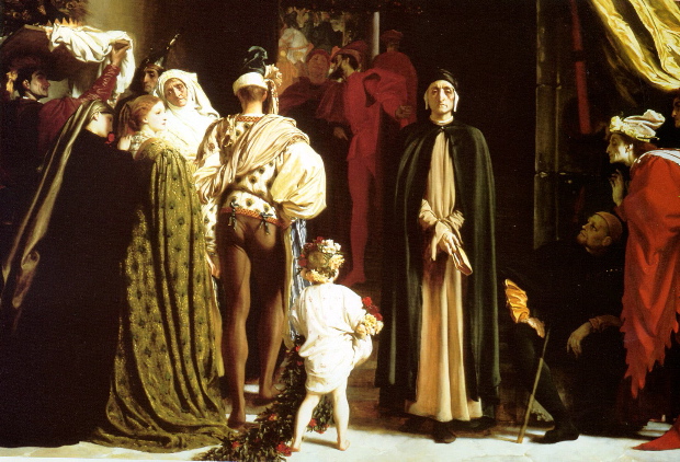
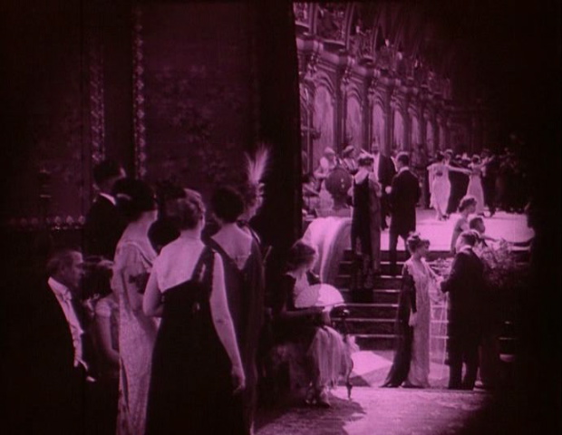
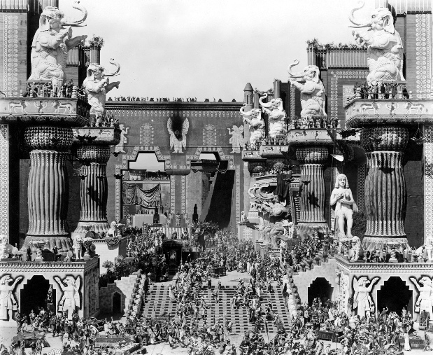
But the intellectual disgrace of the Victorian painters also helped
impoverish cinema, because, after the first glorious blossoming of the
art in the silent era, filmmakers forgot academic painting.  To get
back in touch with its lessons, they had to get back in touch with the
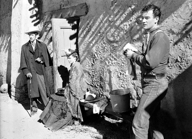
masters of the silent era, like Griffith, Vidor, Murnau and Ford, for
whom Victorian academic painting was a living form and a direct
inspiration of their techniques.  The filmmakers who followed them had
to engage Victorian academic art at one remove, and thus lost touch
with the very forms which had inspired and instructed the original
pioneers of cinema.


The propaganda of the modernist painters, understandable from their
point of view, resulted in a great loss to the visual culture of the
20th-Century.  It couldn’t obliterate the glories of Victorian academic
painting, which survived, transformed, in movies and in popular
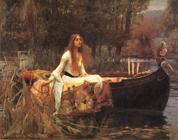
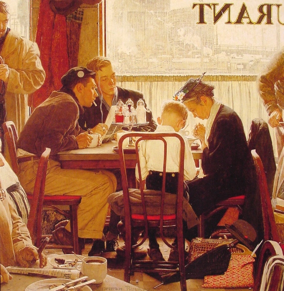
illustration (through the work of artists like N. C. Wyeth and Norman
Rockwell.)  But it distorted the intellectual appreciation of a visual
tradition which might have been of great use to artists, film artists
especially, if they hadn’t been shamed into despising it on principle.


I would argue that a new appreciation of Victorian realist painting has
the power to recharge the art of cinema in our time — quite apart from
the pleasures to be gained by directly encountering a vital and
ravishing visual tradition.


A TISSOT FOR TODAY

Ces Dames de Chars.

Notice how the lead horse gallops into an imaginary space in front of
the canvas, while the eye is simultaneously drawn in the opposite
direction, through a series of distinct interior spaces within the image — the bright covered arena, the darkened audience galleries — that open up
behind the lady charioteers.


To read more about Tissot go here.