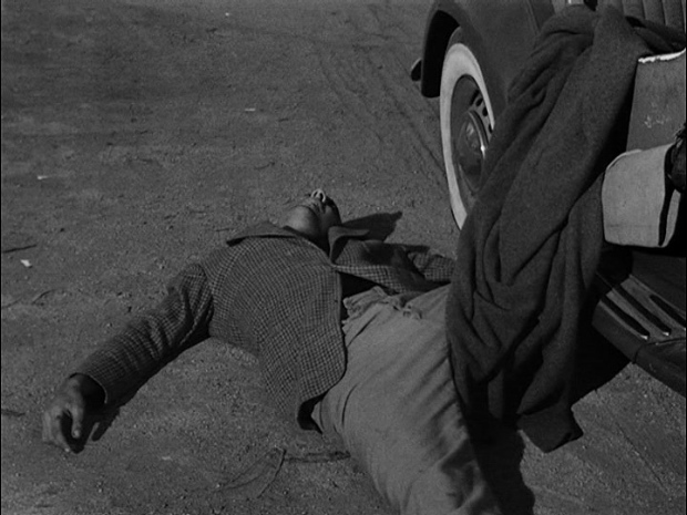
THE MESSAGE OF FILM NOIR

In my last post I wrote:

I would argue that pulp fiction, hardboiled fiction, from the
20s and 30s is something different from the wartime and post-war films that are, to me at least, the heart of the
film noir tradition.  Film noir
drew on that fiction, just as it drew on the 30s-era crime melodrama
and conventional detective fiction, but it became something new.

So what was new about it?

James Ellroy summed it up best when he observed that the basic message of
film noir
is “You're fucked.”  It's an existential message, philosophical
(or perhaps theological) in nature.  Another way of putting it
might be “The world is fucked, at its core, and there's nothing you can
do about it.”  You might temporarily survive the predicament this
puts you in, or it might destroy you, but the predicament isn't going
to change.

This represents a profound divergence from the traditional “hero's
journey”, in which an everyman faces tests and ordeals in the pursuit
of wisdom, of meaning.  It also represents a divergence from the
“outlaw ballad” tradition of the 30s-era crime melodrama, in which we
explore the underworld and revel in the transgressive behavior of
society's rebels — all the while confidently expecting the rebel's
death and a reassertion of humane values.  In true noir, those traditional values have evaporated.

You have to ask yourself why such a radical divergence from earlier
traditions happened in the post-WWII era, and the answer to me is
obvious.  The basic message of war, and particularly of combat, is
“You're fucked.”  The soul-shaking experience of hearing this
message delivered in the most brutal terms doesn't go away after the
war ends, even if it ends in victory.  It is not subsumed in
feelings of patriotism or in the satisfaction of having done one's duty.

It endures forever.  In the case of WWII it had a macabre
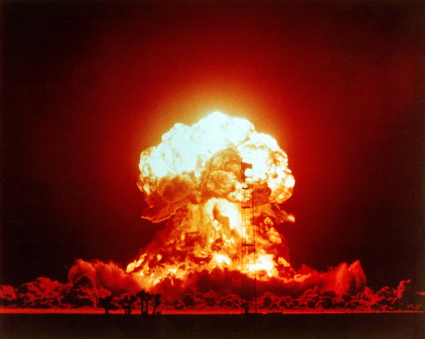
objective correlative — the atomic bomb, the image of the mushroom
cloud, which summed up the enduring sense of existential dread that had
infected American society, and in particular its returning war vets.

Film noir was an arena in
which that existential dread could be engaged safely — and there was
something exhilarating about the exercise, the exhilaration of dealing
with an urgent but buried anxiety.  The existential dread I'm
speaking of here didn't define post-war America but it was there, and
it couldn't be talked about directly in a world that was desperately
trying to get back to normal.  But it could be faced in art — most especially in film noir.

WHAT IS DOMESTIC NOIR?

Tony
D'Ambra of the ever useful films noir web site posted an interesting
comment about my Film Noir Master List which I'm eager to respond to:

Tony wrote:

I doubt you will welcome this comment, but here goes.

I'm delighted by all thoughtful comments!

He continued:


I don't see the point of your classification system: it has meaning for
you only and no film can ever be categorised to such a degree.

I realize that my list violates convention, but others have found it
useful, if only as a provocation to further thinking about the
subject.  It's primarily intended to provoke a new conversation about film noir, which in my opinion has gotten to be such a vague term that it's losing its usefulness.

And Tony wrote:


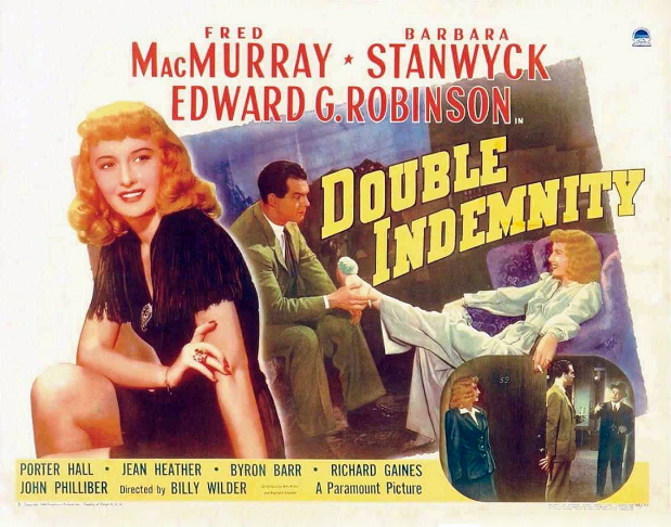
For example, there is wide agreement that Wilder's Double Indemnity
is an elemental film noir, yet you describe it as a “domestic noir”?
Neff is an unmarried loner and Phyllis an amoral gold-digger whose
marriage was a sham from day one, so how does domesticity gone bad come
into it? There is “no moral confusion” or “existential dread”: both
protagonists are motivated by greed and each has no scruples when it
comes to making sure that only one of them makes it to the end of the
line. Marriage has nothing to do with the dramatic imperative of the
plot. Remember Phyllis murdered Dietrichsen's first wife, so she could
marry him for his money. Neff was ready to be seduced and she knew it:
this is the essence of the noir paradigm of the femme fatale, which has
little to do, if it ever to did, with the role of woman in WW2 and its
aftermath. Remember, the great noir novels by Hammett and Cain, were
written before WW2.


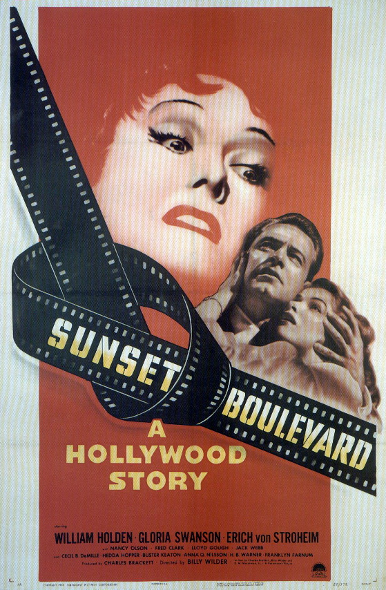
Domestic noir, to me, from Double Indemnity to Sunset Boulevard,
is characterized primarily by a rancid view of domestic life, and
especially married life.  It's not about good marriages gone bad
— instead it reflects a jaundiced view of the domestic realm, sees it
as corrupt, no longer viable, infected by the moral chaos, the
existential bewilderment, of the wartime and post-war world.

Double Indemnity takes place primarily in middle-class homes and offices — not in the typical urban jungle of the classic noir, the labyrinth of the dark city.  In the domestic noir, the existential dread symbolized by noir's dark city has penetrated the “normal” world, transformed
it.  Both traditions are dealing with the same existential dread,
but viewing it from different angles — different enough to constitute
two distinct traditions.

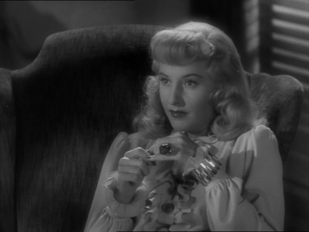
Phyllis Dietrichsen is indeed a femme fatale, one of the most fatale in all of movies, but the presence of a femme fatale doesn't automatically make a film noir, anymore than the lack of one excludes it from the category.  The femme fatale in the person of the vamp was a staple of silent cinema, featured in films we would never think of calling noir, and many classic films noirs have heroines who save the protagonist.

Finally, I would argue that pulp fiction, hardboiled fiction, from the
20s and 30s is something different from the wartime and post-war films that are, to me at least, the heart of the film noir tradition.  Film noir
drew on that fiction, just as it drew on the 30s-era crime melodrama
and conventional detective fiction, but it became something new. 
My underlying argument in all this is that we lose sight of what made film noir
new and distinct when we confuse it with its antecedents and with other
films that were dealing with the same cultural anxieties in different
ways and in different contexts.

THE CIVIL WAR

As a prelude to watching Ken Burns' new film about WWII, The War,
I decided to have another look at his film about the Civil War. 
This isn't really a documentary, or a work of history — it's a poem,
made up of very beautiful words, both newly written and derived from
historical sources, of images and of music.  It's in fact an
example of a new art form — a new extension of what a movie can be,
but so organic and effective that you wonder why no one ever tried it
before.

One of its glories is that it so boldly deviates from the conventional
filmmaking wisdom of its day.  It constitutes a contemptuous
defiance of MTV-style cinema.  MTV-style cinema is founded on the
proposition that none of its constituent images has any inherent
quality or interest — none of them is worth your serious
attention.  But the resulting strategy is to simply bombard you
with vaguely engaging images which pass so quickly that you don't have
time to evaluate them — thus producing the impression that perhaps you
have actually seen something worth seeing.  The art of it is the
art of the three-card monte mechanic.  You aren't exactly the
audience for this sort of cinema — you're the sucker, the mark.

Burns, by contrast, doesn't need to use cinematic techniques to
distract you from the fact this his basic material is shabby and
second-rate — because it isn't.  This allows him to step back,
let the material breathe, speak for itself.

His primary technique is extraordinarily simple and extraordinarily
effective.  It is simply to marry one image with one
sentence.  Sometimes he will vary this rule, cutting to a new
image on a phrase ending, or showing different details of the same
image within the same sentence.  Occasionally, for purposes of
emphasis or surprise, he will cut to a new image illustrating a single
word or name in a sentence.

But the primary strategy is  generally maintained — one sentence,
one image.  Once you get used to this, subliminally, it allows you
to absorb the contrapuntal lines of word and image in a kind of
composure of attention.  There
is a third line, of course — the music.  But Burns does something
unusual with that as well.  He recorded the music first and then
conformed the pace and tone of the spoken quotes and narration to the
music, and adjusted the images accordingly.

The result is dense and many-layered — each line of Burns' film has a
life and momentum of its own and does not dominate the other lines . .
. but it has the wholeness and integrity and logic of a fugue.

It's a remarkably fine piece of work.

A NORMAN ROCKWELL FOR TODAY

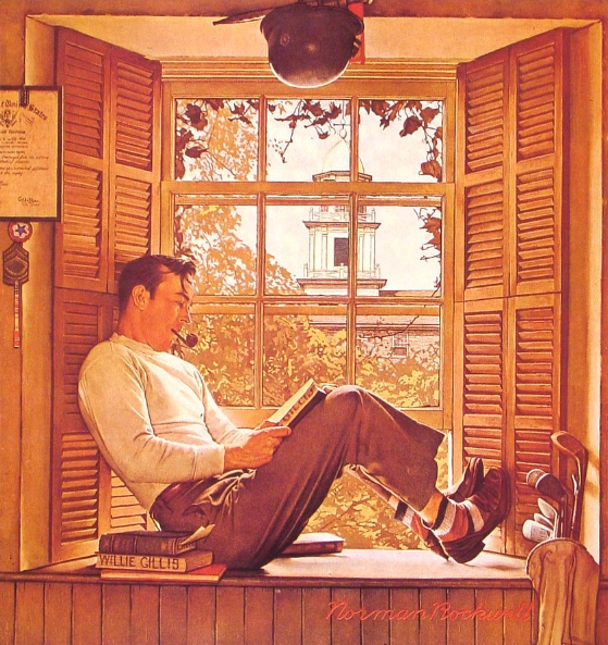
During the WWII years Norman Rockwell created a character named Willie
Gillis — an ordinary guy from a small town who joined the army. 
Rockwell chronicled his experiences in the war in a series of Saturday Evening Post
covers.  After the war, he showed us Gillis returned to civilian
life — above you see him in college, on the G. I. Bill, having
survived and put on a little weight.

It's a poignant image, for all it doesn't say.  Gillis is
preparing himself for a “normal” life in post-war America, with his
pipe and his golf clubs — but the war souvenirs hanging over his head
suggest that he will always be haunted by memories out of place in a
“normal” world.

One of the virtues of Ken Burns' newest documentary The War
is that it addresses the sort of post-traumatic stress disorder that
returning vets, and the whole civilized world on some level, suffered
in the wake of WWII.  For the vets it was peculiarly disorienting,
with feelings of triumph, guilt and shame all mixed up together. 
It was
not something that could be talked about in the world Willie Gillis was
trying to become a part of.

All of this I think reinforces my notion that it was in art, in film noir
particularly, that such disorientation could be engaged in a safe way,
a socially acceptable way.  You can read more thoughts on
the subject here.

DIGGING UP DISNEY

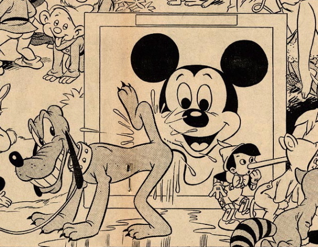
Above is a detail from a cartoon published in The Realist in 1967.    [Mature viewers not offended by moderately graphic sexual and scatological satire can click here to see the whole thing.]  I'll
never forget how happy it made to see this cartoon for the first
time.  I was seventeen then — I saw it in the dorm room of a
fellow student at my prep school who had a staggering
collection of underground publications, including a complete run of
Paul Krassner's The Realist. 
I can't believe the school authorities knew how much subversive
literature he had stowed away in his room — or how widely it was
corrupting the imaginations of his fellow students.  The Realist was truly shocking stuff in 1967.

The image made me happy not because I hated the classic Disney cartoons
and characters — but because I loved them.  I loved them too
much, and unconsciously.  They were embedded in my psyche on
deeper levels than I ever suspected.  To see them dragged
unwillingly into the light of an adult consciousness, mocked and
defiled, sexualized, allowed me to engage them as an adult — to try
and assess how they had affected me.  And it allowed me to
appreciate them as great works of art — not just as cultural
baggage.  That appreciation has only grown over time.

Transgressive, subversive
culture works in counter-intuitive ways.  By breaking spells, it
can lead to deeper realms of magic and enchantment . . . which
themselves will one day have to be transgressed and subverted.

Issues of The Realist are being archived on the web now — you can peruse them here.

FILM NOIR: A MASTER LIST

Below is a provisional master list of what to me are the canonic films noirs, followed by lists of films that are often identified as films noirs
but which I think fall into different categories.

THE FILM NOIR CANON

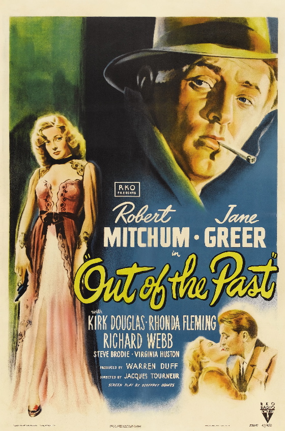
Out Of the Past
The Killers
His Kind Of Woman
The Dark Corner
The Set-Up
Gun Crazy
Fallen Angel
Angel Face
Touch Of Evil
Detour
The Wrong Man
Criss Cross
The Killing

In A Lonely Place
On Dangerous Ground
Crossfire
Where the Sidewalk Ends
Brute Force
The Sweet Smell Of Success
Night and the City
Thieves Highway
The Lady From Shanghai
14 Hours
The Long Night
Nightmare Alley
Odds Against Tomorrow
Act Of Violence
Crime Wave
They Live By Night
Decoy
The Big Steal
Side Street
Where Danger Lives
Tension
Kansas City Confidential
The Big Combo
Gilda
Road House


HARD-BOILED DETECTIVE THRILLERS

Murder, My Sweet
The Lady In the Lake
I Wake Up Screaming

The Big Sleep
Behind Closed Doors
The Mask Of the Dragon
Vicki


DOMESTIC NOIR

Shadow Of A Doubt
Clash By Night
Leave Her To Heaven
Sunset Boulevard
The Night Of the Hunter
Blonde Ice
Daisy Kenyon
The Bad and the Beautiful


POLICE/AGENCY PROCEDURALS (DOCU-NOIR)

House On 92nd Street
The Racket
Call Northside 777
Panic In the Streets
Border Incident
The Narrow Margin
Mystery Street
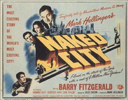
Naked City
Arson, Inc.
Loan Shark
Fingerprints Don’t Lie
F. B. I. Girl
Portland Expose
A Bullet For Joey


PSYCHOLOGICAL SUSPENSE THRILLERS

Whirlpool
The Big Clock
House On Telegraph Hill
The Blue Gardenia
Shock
Sudden Fear
Shadow Man
The Stranger

LATE-CYCLE CRIME MELODRAMAS

They Drive By Night
High Sierra
The Asphalt Jungle
Key Largo
Railroaded
Shoot To Kill
The Big Heat
Tough Assignment
Force Of Evil

FILMS OF INTERNATIONAL INTRIGUE

Contraband
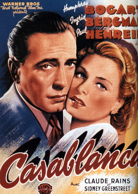
Casablanca
To Have and Have Not
Notorious

Macao
I’ll Get You
The Man From Cairo
They Were So Young
Mr. Arkadin (Confidential Report)


SUI GENERIS (NOIRISH BUT NOT LIKE ANY OTHER NOIRS)

Trapped
(Schizo-Noir)
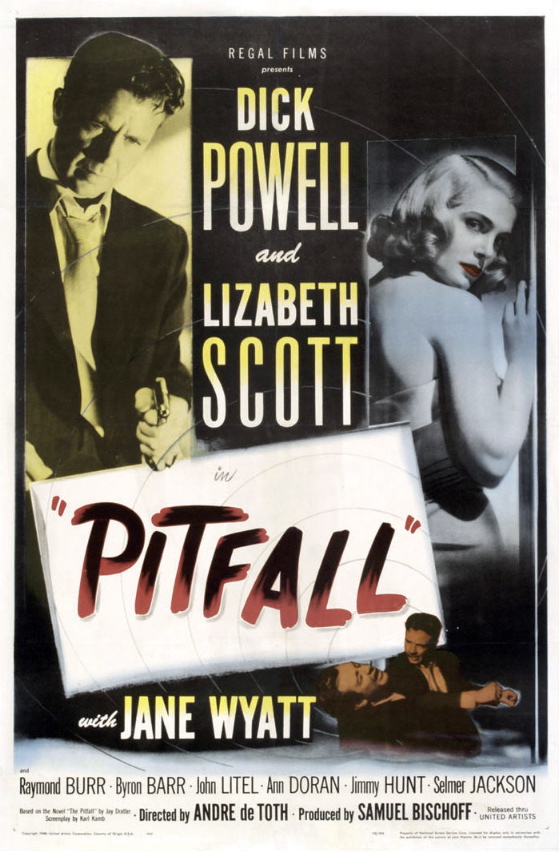
Pitfall
(Anti-Noir)

TRUFFAUT HITCHCOCK

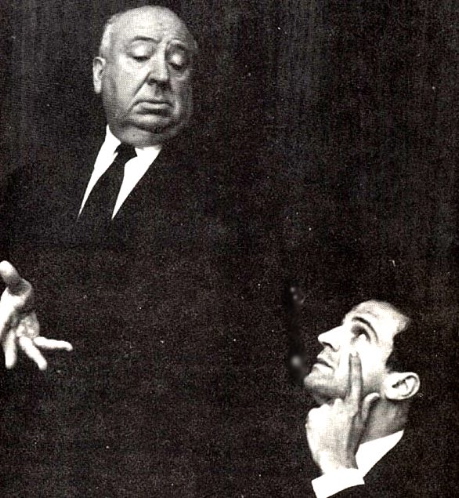
Among the many interesting things to be found at the If Charlie Parker
Was A Gunslinger
web log are audio files of many of the
Truffaut-Hitchcock tapes, from which Truffaut's great book of
interviews with Hitchcock was compiled.


It's fascinating, and inspiring, to hear the actual voices of the two
men talking about film with such wisdom and passion — and, in the case
of Hitchcock, often enough, sly misdirection.


You can find the tapes
here.

STAGE AND SCREEN

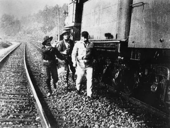
If you look at narrative films made in the first decade of the 20th
Century you'll be struck by a very odd aesthetic anomally.  Scenes shot
out of doors will often be dynamically composed, emphasizing spatial
depth in the image — they look modern and can be extraordinarily
beautiful.  Scenes shot on interior sets will, by contrast, be framed
head-on, creating the impression of a shallow space — this, combined
with the obviously painted sets, mostly using flats, looks decidedly
cheesy to modern eyes.
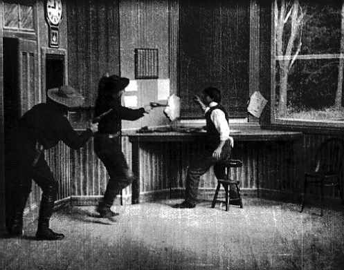


Why did audiences accept this violent contrast of cinematic practices
within the same film?


One reason, of course, is that the interior sets reminded audiences of
the stage, where painted sets and proscenium framing were familiar. 
They could think of these scenes as filmed stage-plays, which is how
story-based movies were often defined and sold.  The exterior scenes,
on the other hand, reminded viewers of pre-narrative cinema — the
“actualities”, short scenes of picturesque places and real events,
which were the primary content of movies presented as novelty
attractions.
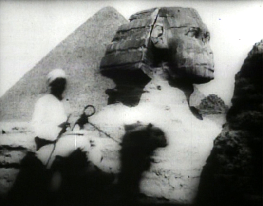
These actualities tended to be agressively “cinematic”,
emphasizing the illusion of spatial depth to show off the magic of
movies — their ability to create the convincing illusion of a real
place on the other side of the screen.

Novelty-attraction actualities were often part of a theatrical
presentation
which featured live performers as part of a variety bill — so viewers
were accustomed to an alternation of cinematic actualities with
theatrical stage-bound scenes.
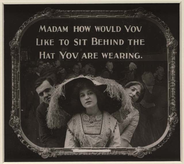


The narrative structure of early story films was apparently enough to
knit the two types of cinematic practice into an aesthetic whole for
viewers of the time.  Indeed there's a curious Edison film from
around 1904, not part of the regular Edison release schedule, which
shows a
group of people making its way by various means of transport from one
end of Manhattan Island to the other.  There's no connecting narrative
— the shots just seem to be a series of “actualities” linked only by
the presence of the same characters in each sequence.  It's been
suggested by film scholars that these sequences may have been shot as
“entr' acts” for a stage play, showing the play's characters moving
from location to location in the story — something to pass the time
and amuse an audience while the stagehands shifted sets behind the
projected images.


If in such a production you just replaced the scenes on the stage sets
with filmed interiors, shot head-on against painted theatrical
backdrops,
you'd have a pretty fair paradigm for an early narrative film.


Even imagining how such anomalous cinematic approaches could have been
reconciled for viewers within the same film, it's hard not to see the
results as crude.  But such anomalous approaches have almost always
been a part of cinematic practice — and the momentum of narrative has
always been able to reconcile them.
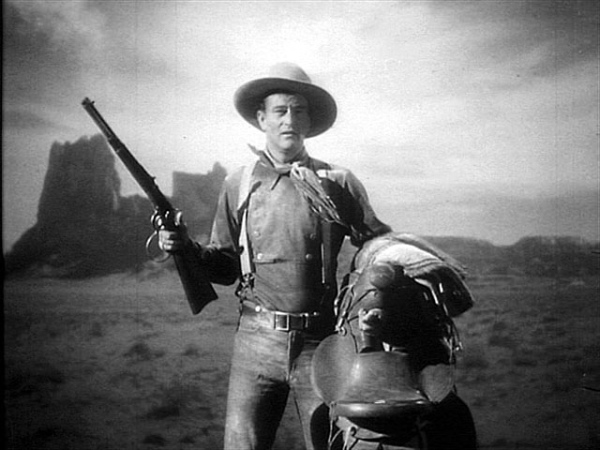
Look at John Ford's Stagecoach
again and see how stunningly photographed images of real locations
alternate with studio work (above) in which sets and back-projections stand in
for exterior locales.  It's objectively weird, aesthetically
inconsistent, but our eyes, accustomed
to back-projections in films of this era, don't read it as such.
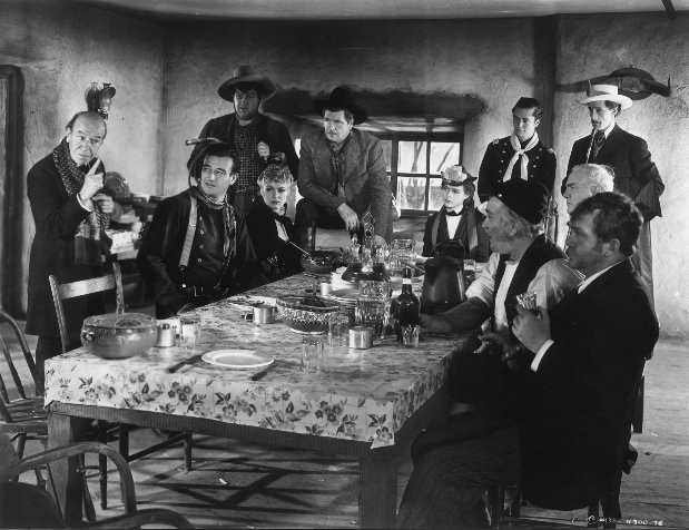


The conventions are always shifting, of course.  The studio-built
interior sets of Stagecoach (above) are fully three-dimensional and
convincing as actual locations — a far cry from Edison's patently
two-dimensional interior sets painted on flats.  But Ford's
back-projection exteriors are convincing only to the degree that we
choose to be
convinced by them, as Edison's audiences chose to be convinced by his
artificial interior sets.

The history of the shift from “theatrical” to fully dimensional interiors in movies would be fascinating to chart.

One of Griffith's main formal concerns in the Biograph years was
developing a way of staging and photographing interiors on sets in
spatially interesting ways, to create a stronger illusion of being in
real rooms — but he never totally abandoned proscenium framing.
Why?

I'm beginning to think that proscenium framing for interiors continued
to have a degree of glamor for filmmakers throughout the silent era, by
evoking the prestige of the stage.
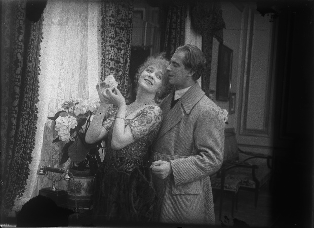
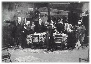
Twice in Erotikon, from
1920 (above), which has elaborately constructed and
convincing interior sets, such a set is introduced by a wide, head-on
proscenium type shot — before Stiller moves in and starts shooting the
room as though it were a practical location, sometimes even shooting in
mirrors that reflect the wall behind the camera, utterly abolishing the
theatrical mode by showing us the “fourth wall”.
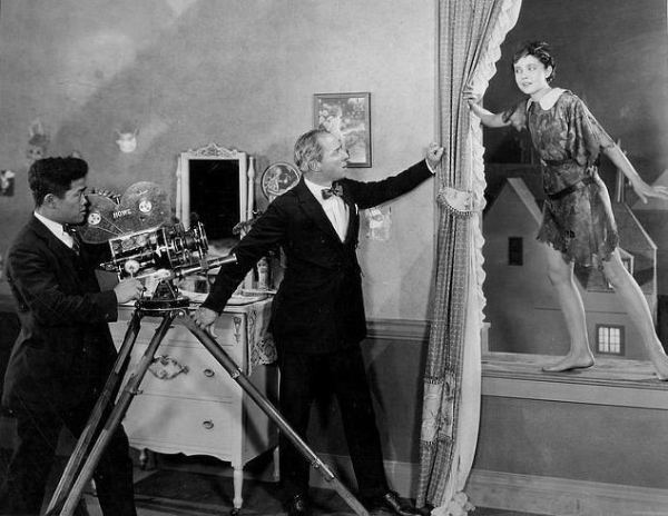
In Peter Pan, Herbert Brenon (above, with camerman James Wong Howe and Betty Bronson) does something similar with the opening sequence
in the nursery — which he starts out showing only from angles that
would have been available to members of an audience seated in front of
his set, but then proceeds to penetrate from angles only available to
performers inside the set.

Both Erotikon and Peter Pan were adaptations of popular stage
plays, and the filmmaker in each case may have wanted to remind viewers
of the film's prestigious theatrical provenance.
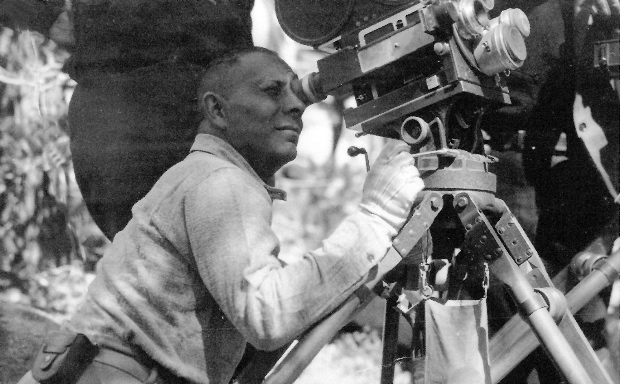
Von Stroheim seems to have been the first film artist to abolish the
theatrical mode for interiors as a matter of basic aesthetic principal,
and he was followed in this approach fairly consistently by Murnau as
well.  From them derive the dynamic spatial interiors of Renoir
and Welles.
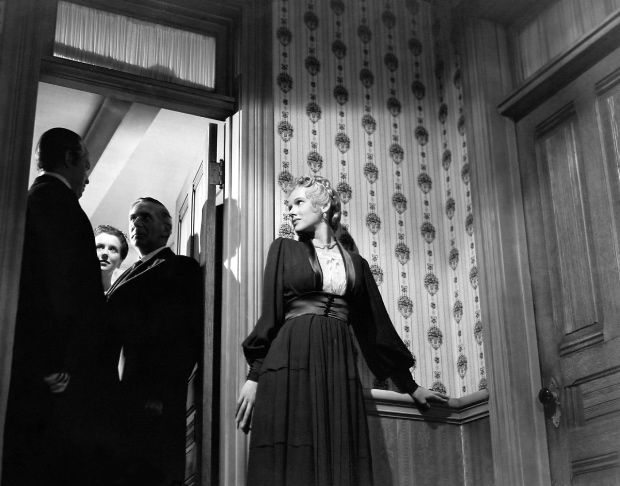
[With thanks to shahn of sixmatinis and the seventh art for a recent post which got me thinking about this subject again.]
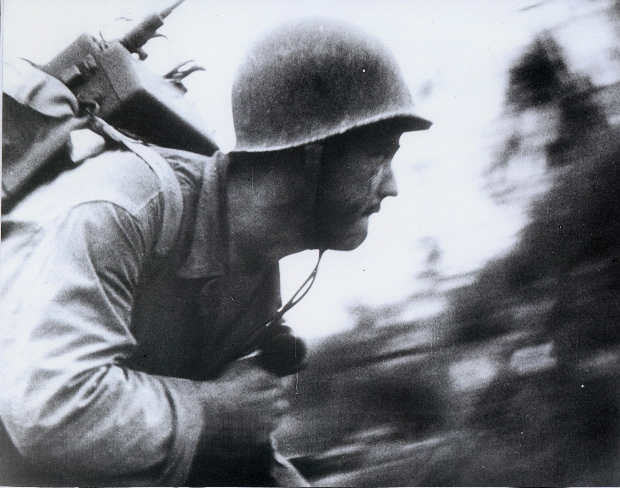
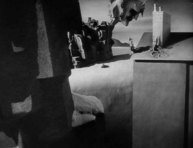
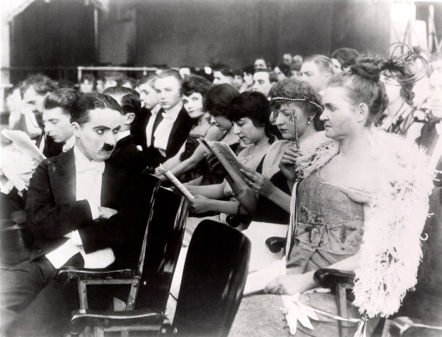
MOVIE DREAMTIME


When
we think of dreamlike films, or dream sequences within films, we
inevitably think of the expressionistic style filmmakers often use
to signal a dream state — but of course real dreams do not present
themselves in that way. We might, in a dream, find ourselves at home
and discover a previously unnoticed door opening onto a previously
unsuspected wing of the house — but that wing is not appointed like
the cabinet of Dr. Caligari . . . it is as convincingly real a place,
in the dream, as the actual house we know.


THE SLAPSTICK ENCYCLOPEDIA


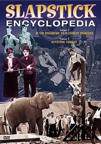
In
case there's anyone out there who doesn't know it,
The Slapstick
Encyclopedia
is awesome — offering about eighteen hours worth of
silent comedy shorts on five DVDs. It's an education in silent comedy,
and the first lesson it teaches is that silent comedy could accommodate
a stunning range of talent and tone, from the subtle sophistication of
Sidney Drew to the certifiable madness of Charlie Bowers.


The
pantheon isn't seriously challenged, however — the work of Chaplin,
Keaton and Lloyd shines with a special radiance, as you'd expect — but
there are pleasant surprises at every turn.


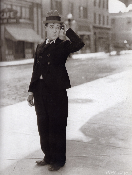
Harry Langdon remains a
puzzlement to me, based on the two shorts included here, from his
Sennett days. I can't decide if his art is sublime or boring or, by
some mysterious alchemy, both at once. Langdon moves so beautifully
that you simply can't take your eyes off of him, even though you
desperately want to.


The
Charley Chase vehicle
Fluttering Hearts, directed by Leo McCarey, has
a light but sure comic tone that never falters, and a short directed by
Roscoe Arbuckle after the scandal,
The Iron Mule, is proof positive
of Arbuckle's exquisite plastic imagination.


The
collection is organized logically but flexibly, with shorts grouped
sometimes by studio, where there was a strong studio style at work (in
the cases of Sennett and Roach,) sometimes by artists noted for their
collaboration, sometimes by theme.


Chaplin appears in a volume devoted
to the influence of the English music hall, and it's fascinating to see
how much he took from its traditions, and also how magically he
transformed them. Lesser artists working from the same traditions —
even the wondrous Stan Laurel — simply inhabit another, more
circumscribed realm of cinematic possibility.

The Slapstick Encyclopedia ends with a grab bag called The Anarchic Fringe, which
presents several shorts of outright lunacy verging on the incoherent,
but t
he
collection
actually climaxes in the penultimate volume, The Race Is On,
which offers comedies involving various mad chases. Chasing Choo
Choos
, with Monty Banks, cut down into a short from the climax of a
feature, includes the God-damnedest train sequence ever put on film.
Delirious, relentless, impossibly beautiful and beautifully impossible,
it's one of the most glorious passages in all of movies, and is as
close to a religious experience as one can have by purely cinematic
means.

The
DVD set is marred by one irritation. There is no single listing by
volume and disc of all the shorts included. This will only bother you
when you decide to revisit one of the many treasures included — but
then again that's something you'll probably end up doing a lot. The
Silent Era website offers a complete listing of the films which is
worth printing and keeping with the box.


Here's a link to the list:

The Silent Era Web Site

Check out other posts in the Slapstick Blog-A-Thon here.

THE LOOK OF NOIR

It’s a commonplace of writing about film noir to see its dark, moody lighting as derived more or less directly from the German expressionist cinema of the 1920s and 1930s, best
exemplified in work done at the UFA studio in Berlin.  The proposition is logical enough — the “UFA style” had become a kind of shorthand in Hollywood for highly exaggerated, expressionistic lighting, and many of the cinematographers and directors associated
with film noir had European backgrounds, with experience working at UFA itself or in traditions influenced by it.


The proposition gets a little shaky, however, when you examine the visual style of film noir
with a careful attention to detail.  Its resemblance to the look of UFA-style expressionism is mostly superficial.  The UFA style had a Romantic quality, evoking candlelight and gaslight rather more than popping flashbulbs, stabbing headlights and glaring neon — which characterized the noir style.  The UFA influence is very clear in the Hollywood horror film cycle of the 30s, with its atmospheric, Gothic sets and lighting — but it’s less clear in the jagged edges of light, the jarring collisions of black and white in film noir.

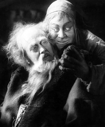
As I’ve written elsewhere: “Lotte Eisner sees Murnau’s visual strategy [in Faust] as one which opposes darkness against light, but this is not quite right, for Faust is not a film of stark contrasts, but of chiaroscuro, of subtle gradations and complications. Light itself is in some ways the protagonist of the film, its mysterious workings and shadings offering a mystical perspective, making the characters and settings emblematic but also providing consolation and inspiration — the sense of a world animated by Spirit.”  This was true of many films in the German expressionist tradition — and was decidedly not the visual strategy of film noir.


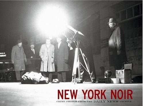
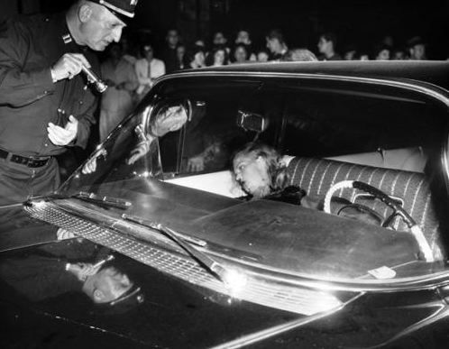
There’s another, home-grown visual tradition that I think had a much clearer influence on the look of noir — the American tabloid crime photography of the 1930s and 1940s.  A book called New York Noir makes a very convincing case for this influence.  It collects images from the pages of the New York Daily News and most of these images echo the look of film noir far more closely than the great films made at UFA.

The visual style in question begins with the adoption of the Speed Graphic camera by the Daily News photographers in the 30s.  Its faster film stocks, along with developments in synchronized flash technology, allowed these photographers to penetrate the night for the first time.  The flash itself created bold contrasts of light and dark and helped construct the public image of the night-time city, especially its seamy underside — an image that is faithfully explored in classic films noirs.

Weegee was the most famous of the Daily News photographers — his book Naked City brought the public a conscious awareness of the tabloid style as a distinct phenomenon,
recognized directly by filmmakers Hellinger and Dassin when they bought the book’s title
for their New York police procedural movie of the same name.  But Weegee was just one of many great tabloid photographers who pioneered this style, who lodged it in the public imagination.


The great filmmakers who worked at UFA before WWII, including many who
eventually made their way to Hollywood, certainly developed and codified expressionistic lighting in movies — but I think the many, mostly anonymous photographers who snapped pictures of crime scenes for the American tabloids had a much greater and more direct influence of the look of the film noir.


The frame below, from Stanley Kubrick’s The Killing, seems to be trying to invoke precisely the look of a tabloid crime scene photograph: